Truist
The merger that redefines banking
The merger that redefines banking

Truist, the merger of SunTrust and BB&T banks, had ambitions to make financial services better—and to do it, they needed an identity that was trustworthy and visionary.
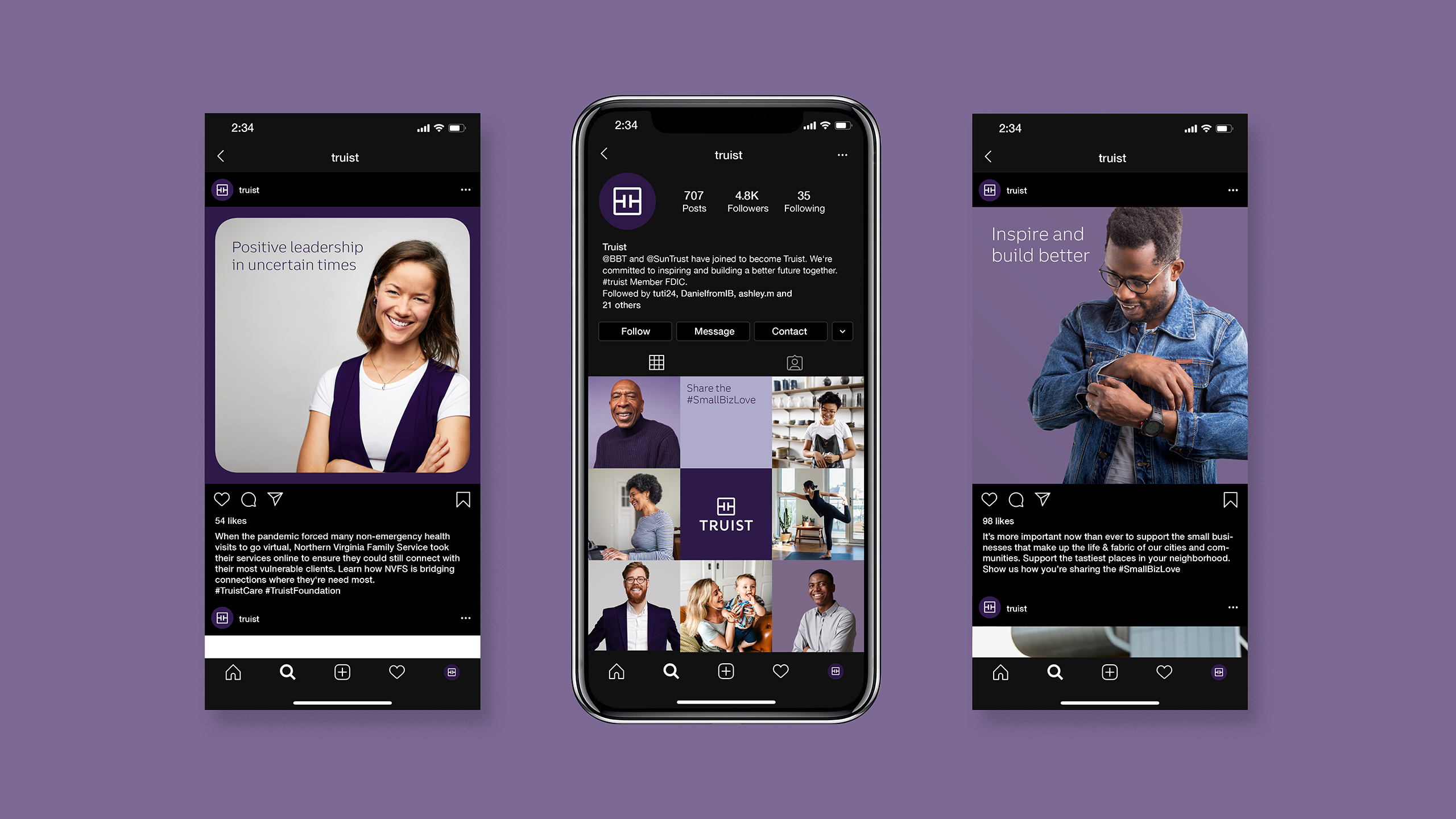
Created from the merger of BB&T and SunTrust, Truist aims to make impact by leading with purpose and delivering a financial experience that balances personal touch and advanced technology. Interbrand worked with them to define this new brand—its strategy, story, name, and identity.


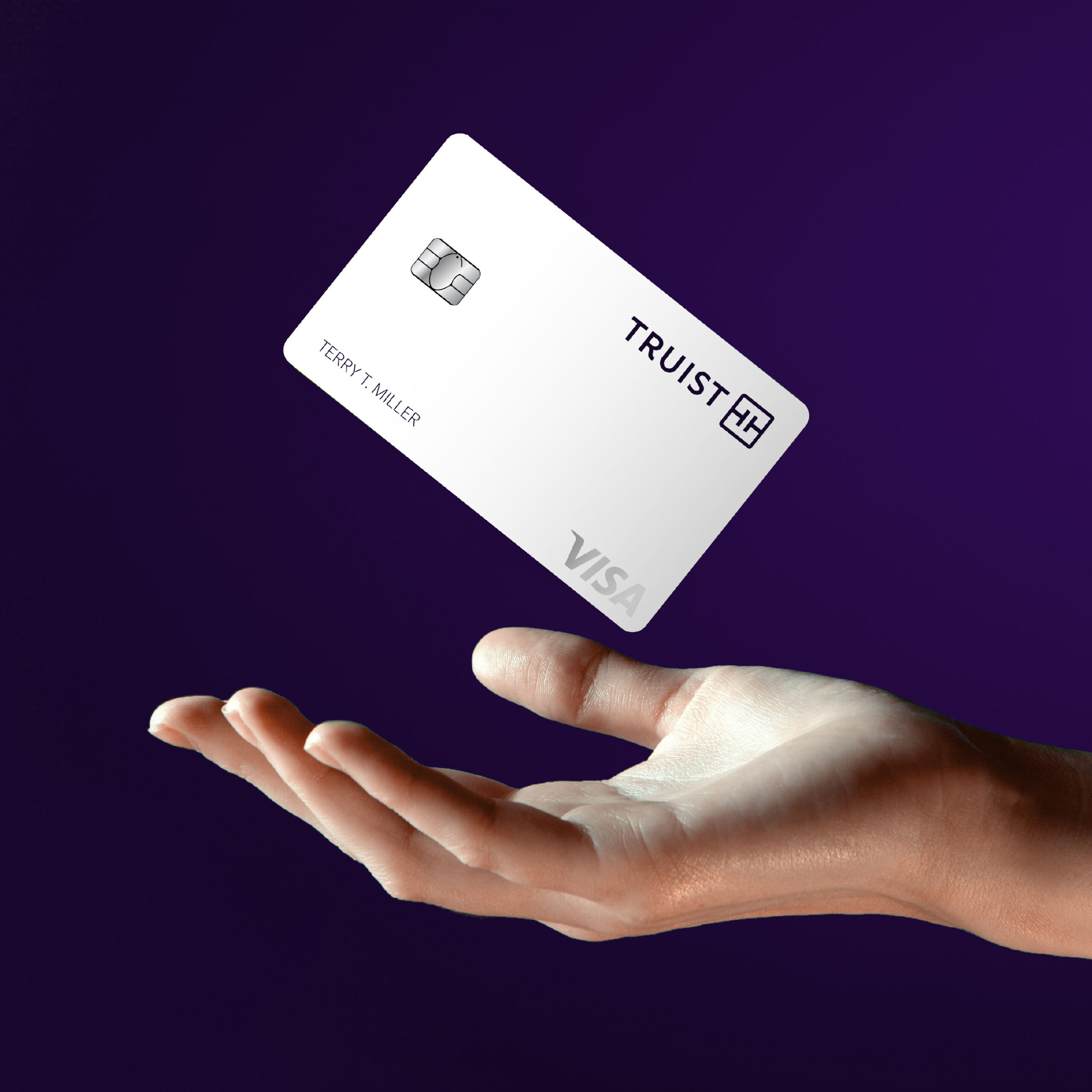
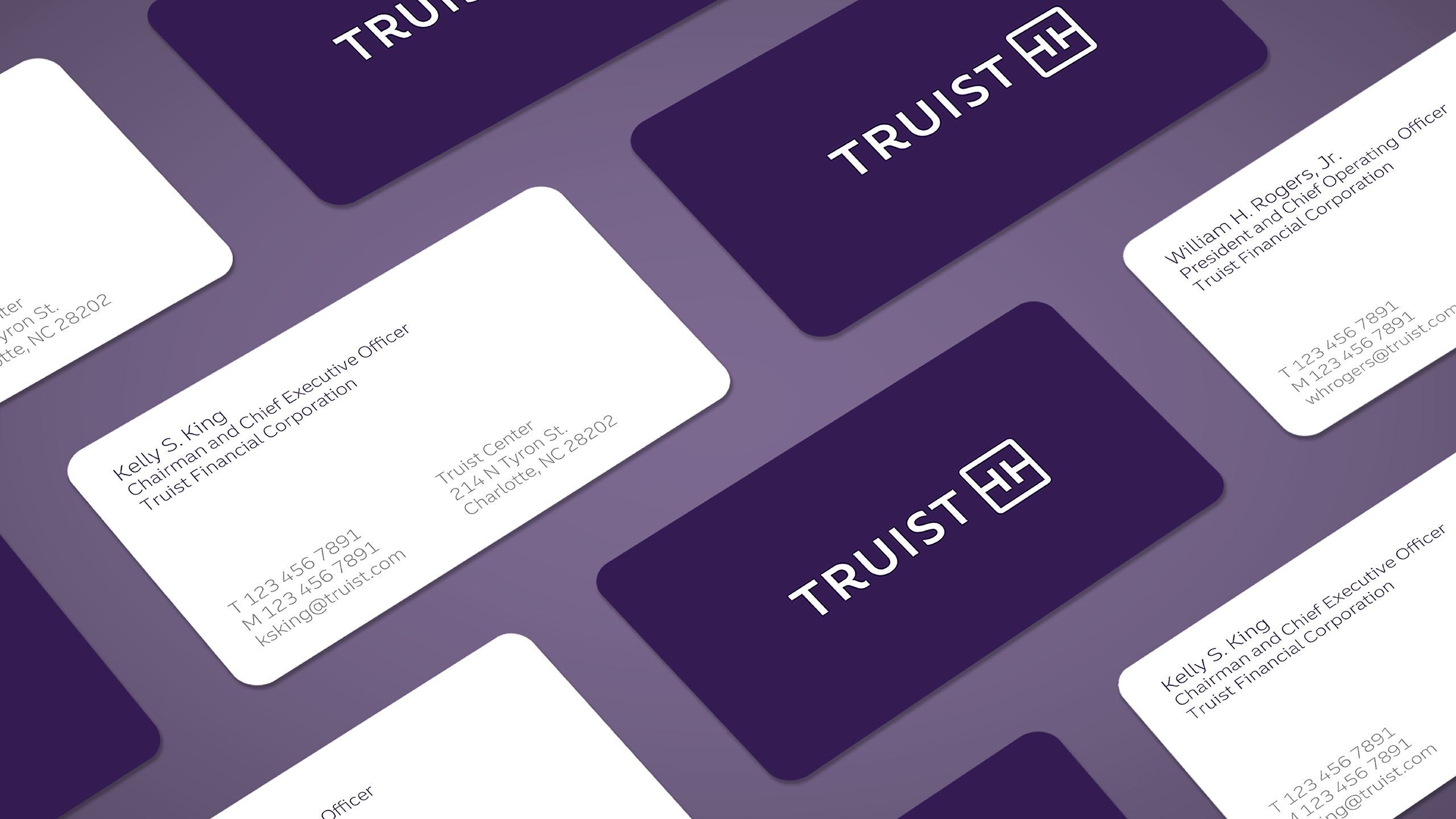
The logo leads with a wordmark that puts the Truist name front and center. As an invented word, the new name looks to the future while feeling familiar—it’s inspired by a commitment to being true, and the brand’s heritage of trust.
It’s complemented by the monogram, made of two T’s that echo the Truist name and represent the defining elements of touch and tech. They’re surrounded by a square with rounded corners that conveys trust, yet feels approachable. That ties to the generous letter-spacing of the wordmark (created by a master typographer), which conveys access and openness. The unique curved leg of the “R” moves the eye from left to right, evoking a sense of momentum toward the future.


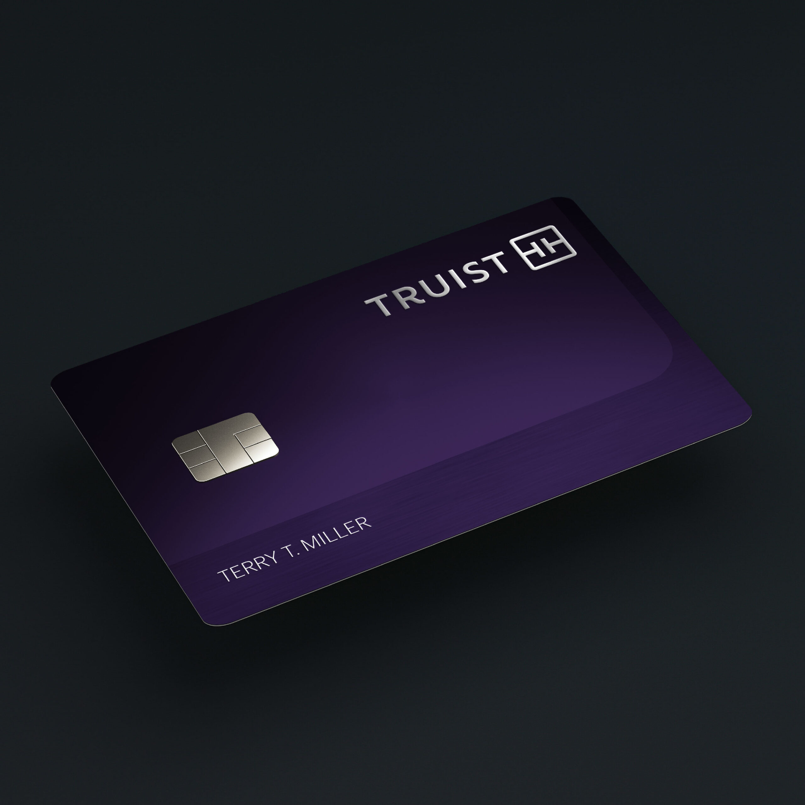
The brand’s signature color, Truist Purple, was designed to stand apart from category conventions. It also nods to the merger of equals by combining the burgundy of BB&T and the blue of SunTrust.
Truist Trio, the proprietary typeface, rounds out the toolkit for the new brand. It was designed to be fluid and intuitive to read, with a bit of the expressive flair and warmth that define the brand.
Together, they add up to an identity that represents the balance of innovation and purpose at the heart of Truist – helping clients, teammates, and communities thrive, while redefining the future of the financial industry.


