LATAM Airlines
Building the brand that connects a continent
We use cookies to help you navigate efficiently and perform certain functions. You will find detailed information about all cookies under each consent category below.
The cookies that are categorized as "Necessary" are stored on your browser as they are essential for enabling the basic functionalities of the site. ...
Necessary cookies are required to enable the basic features of this site, such as providing secure log-in or adjusting your consent preferences. These cookies do not store any personally identifiable data.
Functional cookies help perform certain functionalities like sharing the content of the website on social media platforms, collecting feedback, and other third-party features.
Analytical cookies are used to understand how visitors interact with the website. These cookies help provide information on metrics such as the number of visitors, bounce rate, traffic source, etc.
Performance cookies are used to understand and analyze the key performance indexes of the website which helps in delivering a better user experience for the visitors.
Advertisement cookies are used to provide visitors with customized advertisements based on the pages you visited previously and to analyze the effectiveness of the ad campaigns.
Building the brand that connects a continent
As the world globalized and traveler expectations soared, local airlines, even successful ones, felt overshadowed.
When Chile’s LAN and Brazil’s TAM airlines merged in 2016, Interbrand’s economic market sizing model gave them the confidence to make a bold move: they would drop two highly successful national carriers and re-brand to a single unified voice. This move aimed to create a striking new flagship that would showcase the region’s best to the world.
Since then, LATAM has navigated an intense phase of brand implementation, weathered the storm of a challenging pandemic, yet emerged stronger, reimagining the role it aspires to hold in each of the countries where it operates.
The ambition was to establish LATAM as the airline group connecting Latin America with the world and vice versa. With this in mind, we designed a trajectory that transcends borders while fostering local engagement in every domestic market.
To capture the brand’s essence, we translated the design by crafting a powerful and singular expression. Just as our symbol’s ascending form embodies dynamism and strength, LATAM represents Latin America’s relentless drive to go further. This concept masterfully combines global assets with a vibrant local resonance, echoing the spirit of the region and showcasing its finest qualities.
Drawing inspiration from the region’s own geography, LATAM symbolizes not just a country but an entire region, proud of its origins. Like our symbol’s colors, Indigo reflects efficiency and sophistication, while Coral embodies unique warmth and the Latin spirit. The combination of curves and straight lines, round and sharp angles within the brand identity represents the harmonious union of diverse attributes. Just as the region combines both sides to work with excellence, LATAM pays tribute to its true identity. It stands as a symbol of elegance on the outside and warmth on the inside, in line with the Latin American spirit.
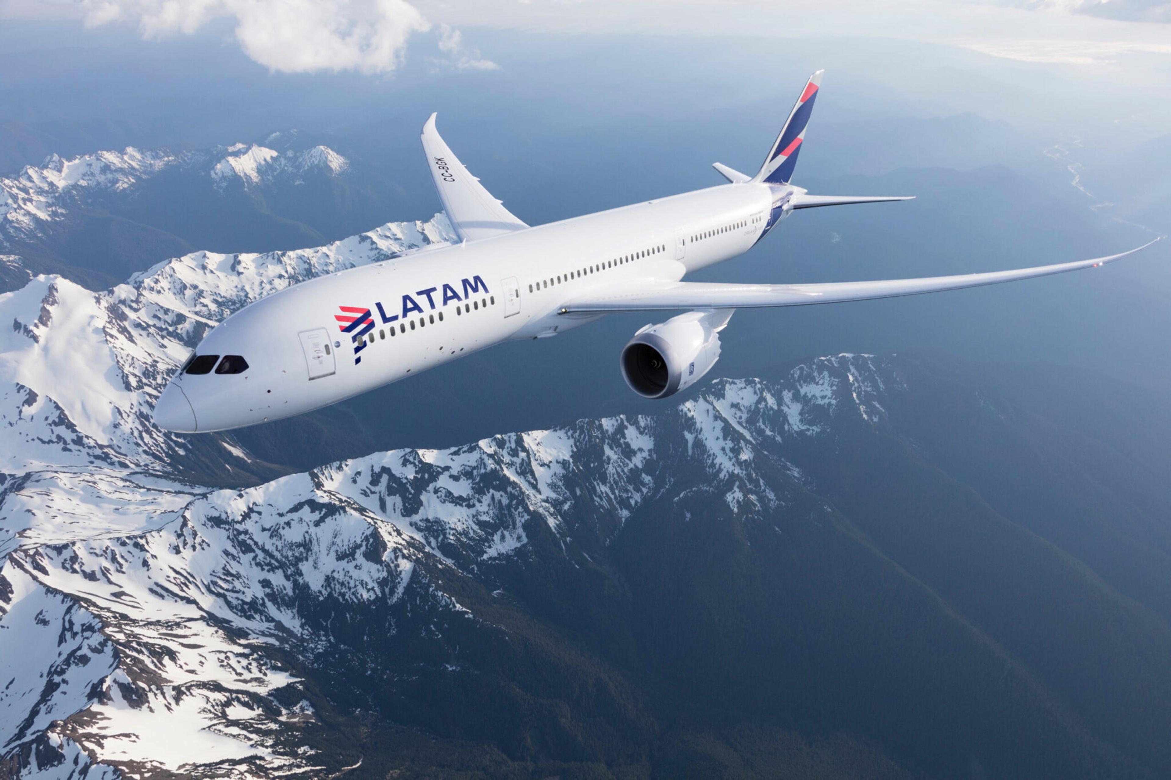
Despite the pandemic’s challenges, LATAM has successfully resumed its growth trajectory, recognized as the top South American airline according to Skytrax 2023, solidifying its role as a leading regional connector. The group strengthened its regional presence, securing the leading market share in nearly all their domestic markets.
The recent joint venture with Delta enables expanded services and connects passengers to over 300 destinations across Canada, the United States, and South America. This partnership signifies that the region is more interconnected than ever before.