Explora
Exploration meets conservation to discover a new arena
We use cookies to help you navigate efficiently and perform certain functions. You will find detailed information about all cookies under each consent category below.
The cookies that are categorized as "Necessary" are stored on your browser as they are essential for enabling the basic functionalities of the site. ...
Necessary cookies are required to enable the basic features of this site, such as providing secure log-in or adjusting your consent preferences. These cookies do not store any personally identifiable data.
Functional cookies help perform certain functionalities like sharing the content of the website on social media platforms, collecting feedback, and other third-party features.
Analytical cookies are used to understand how visitors interact with the website. These cookies help provide information on metrics such as the number of visitors, bounce rate, traffic source, etc.
Performance cookies are used to understand and analyze the key performance indexes of the website which helps in delivering a better user experience for the visitors.
Advertisement cookies are used to provide visitors with customized advertisements based on the pages you visited previously and to analyze the effectiveness of the ad campaigns.
Exploration meets conservation to discover a new arena

Explora was born from an impulse: to discover the marvels of the remotest territories in the world. Over a journey of more than 25 years, they have become world-class pioneers of exploration. And having blazed so many trails, they couldn’t ignore the responsibility inherent to all the knowledge they’ve gathered throughout their path — the commitment to conserve the territories they connect with every day.
They reached a decisive point that called for reaffirming the genuine kind of exploration that makes them stand out, and taking even further steps towards the greater purpose of conservation. It was time to create a clear differentiation from other brands in the field, to empower their own essence and unfold it as a truly authentic identity.
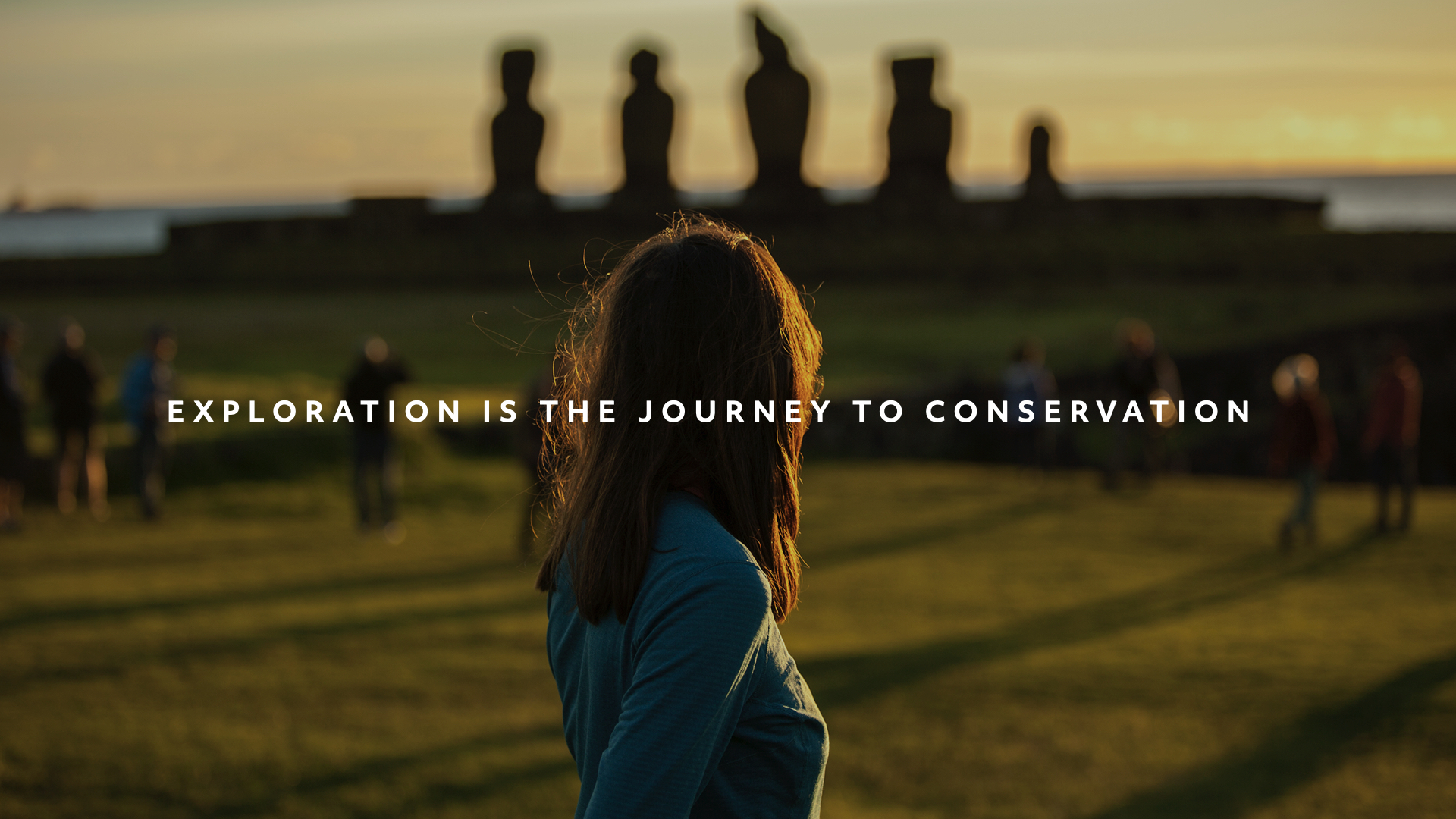

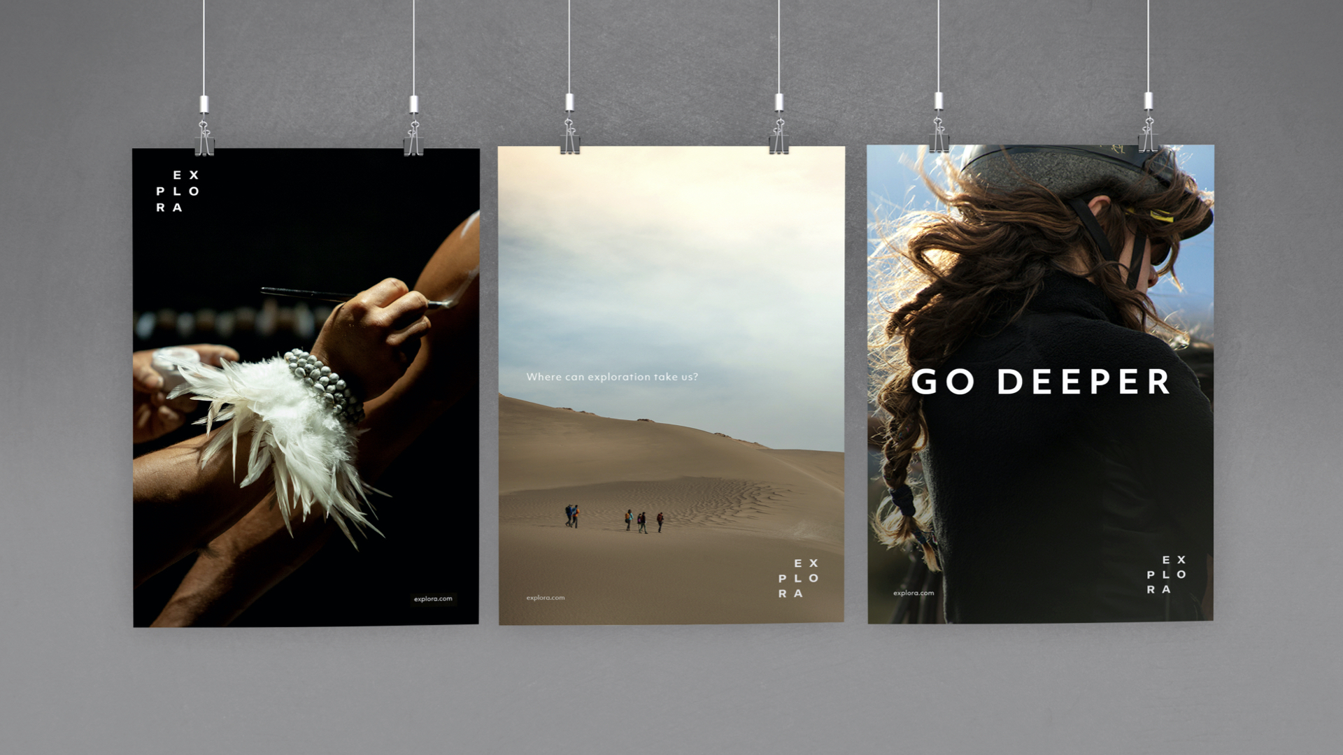
Our starting point was an apparently simple question: “where can exploration take us?”. As we unraveled the essence of Explora, we found out that exploration is so much more than we first thought. We discovered exploration is the journey to conservation.
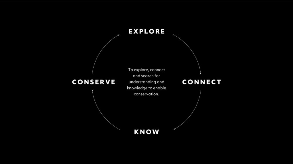
Our whole plan set off from this insight, revealing a journey that goes well beyond the surface. It involves a never-ending cycle: explore the territory, connect with it, know its uniqueness, and then you’ll be empowered and inspired to conserve it. Once complete, the sequence naturally starts over. This is true and meaningful exploration. And we finally understood that the key is to always go deeper.
Explora’s new identity follows the same principle: to ignite the desire of a deep, real bond with nature and remote regions.
We sought to develop the brand’s original visual codes into an even stronger expression. The new identity conveys the aura of an exploration expert, the most powerful enabler of conservation.
The logo originates all the other elements that compose the brand’s visual identity, and it represents the endless journey from exploration to conservation in an inspiring and original form. The typeface was chosen and animated to allude to movement, inspired by the impulse that gave life to the brand.
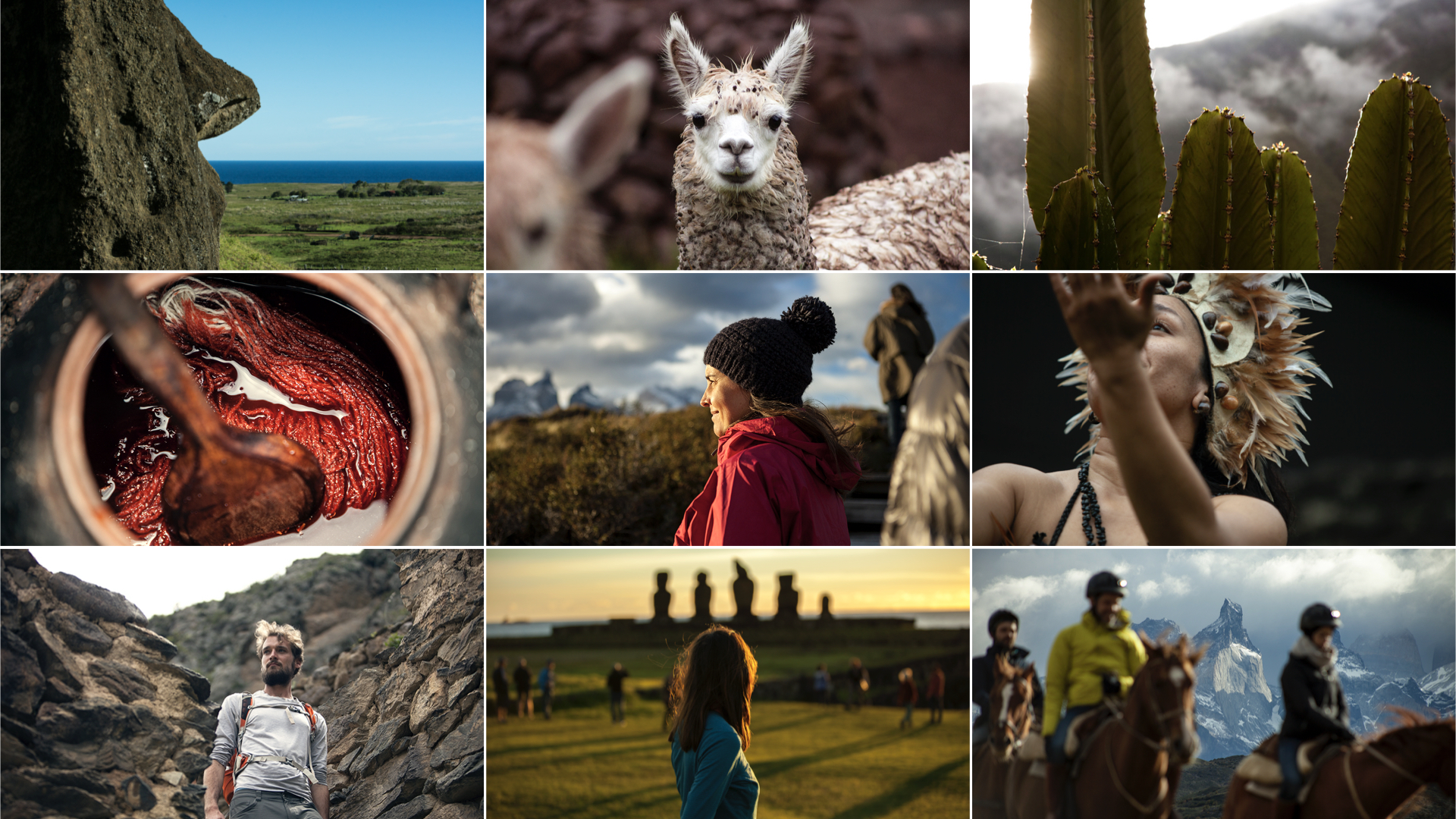
The color palette combines a set of neutral tones, that allow nature and the remote landscapes to stand out and speak for themselves. The photography guidelines depict the idea of “go deeper” through particular angles, the use of zoom & macro lenses, expert crop, and focus and contrast play, so as to represent the entire universe of Explora through the lens of the brand’s own personality.
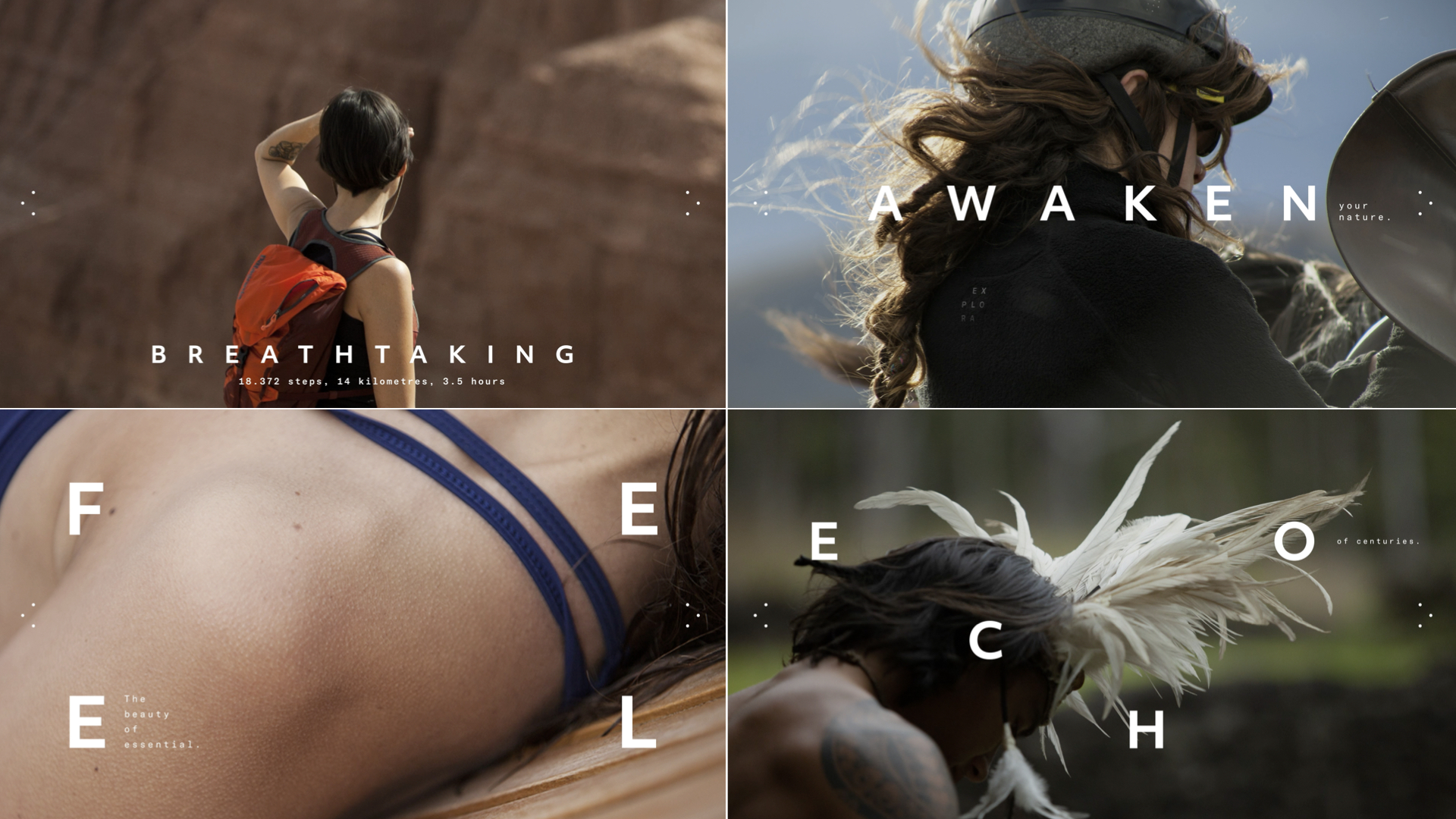

With a new strategy that sheds new light onto exploration, the brand proves that outdoors is not the only setting for such activity — it can happen anywhere, at any time. And so, the very definition of exploration has evolved, now including gastronomy, content, rituals, and many other factors involved in the whole experience, leading to a complete review of the brand’s journey and signatures.
Confident in the connection between exploration and conservation, Explora launches a new model of growth based on Conservation Reserves. A truly iconic move. These are legally-protected territories that create a sustainable model and take the exploration-and-conservation experience to the next level, integrating science, research and exploration in the same place.
As part of this project, Explora have signed an alliance with The Nature Conservancy (TNC), a global organization with an extensive track record in conservation, to collaboratively address the preservation of these iconic ecosystems in the world. Explora just keeps going deeper into its purpose and the world’s remotest locations — today more than ever before.

Awards
TRANSFORM NORTH AMERICA (2021)
RED DOT: Brand Design (2021)