Casey’s
Evolving a beloved 50 year brand with an exciting new experience
Evolving a beloved 50 year brand with an exciting new experience
Office: New York
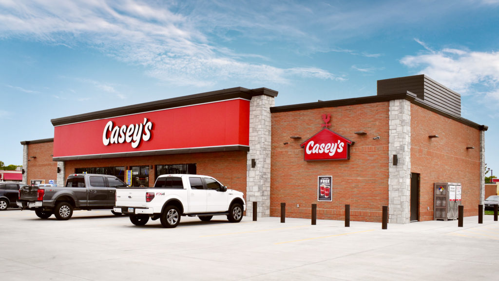
Casey’s is a much-loved mid-western gas station chain that sits at the heart of the communities they serve.
Over the last 50 years, the business has uniquely grown into the fourth (4th) largest convenience store and fifth (5th) largest pizza chain in the US. But as the business has evolved, the logo stayed the same, creating a disconnect between the modern in-store, app and online experience and the brand.
Interbrand’s role was to carefully update the brand to bring it in line with the new products and experiences that Casey’s now offers, while retaining its unique heritage.

The design challenge was developing a solution that could simultaneously reference both parts of the business — gas station and convenience store where you can buy coffee, donuts and their famous fresh pizza.
Interbrand carried out extensive research with customers to understand what specific elements were important to retain. Customers felt there were three key characteristics: (1) The iconic barn shape synonymous with Casey’s, (2) the bold red barn color, and (3) the quirky personality of the existing logo.
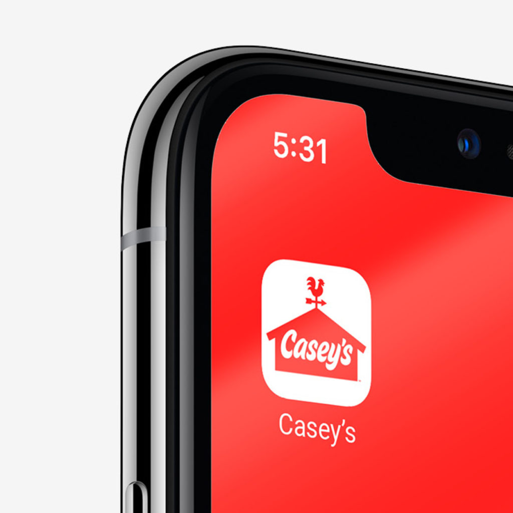
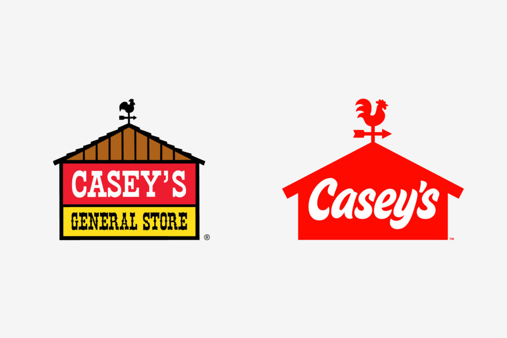
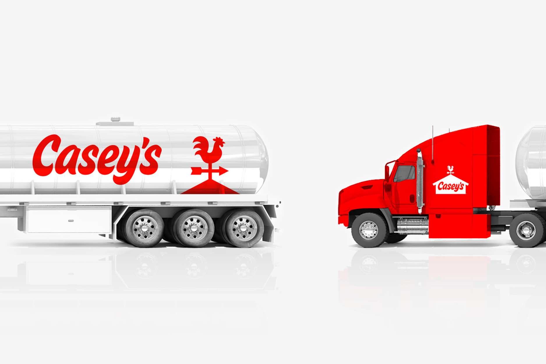
The refreshed brand retains and optimizes the barn for digital environments by removing the shingles and adding defined eves. Typographer Jesse Ragan custom cut the logotype to improve legibility while retaining the quirky characteristics. The new logo also elevates the weathervane as a key brand asset with an improved rooster illustration that reflects the forms of the logotype. These uniquely combined design elements allow Casey’s to flex into everywhere it needs to show up.
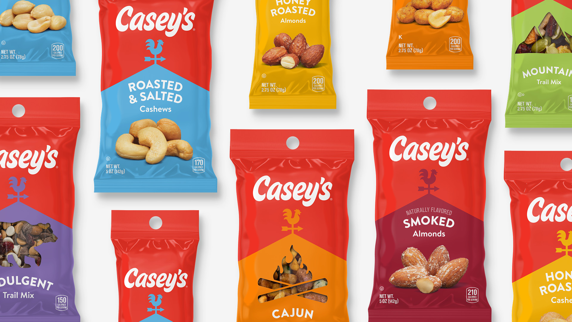
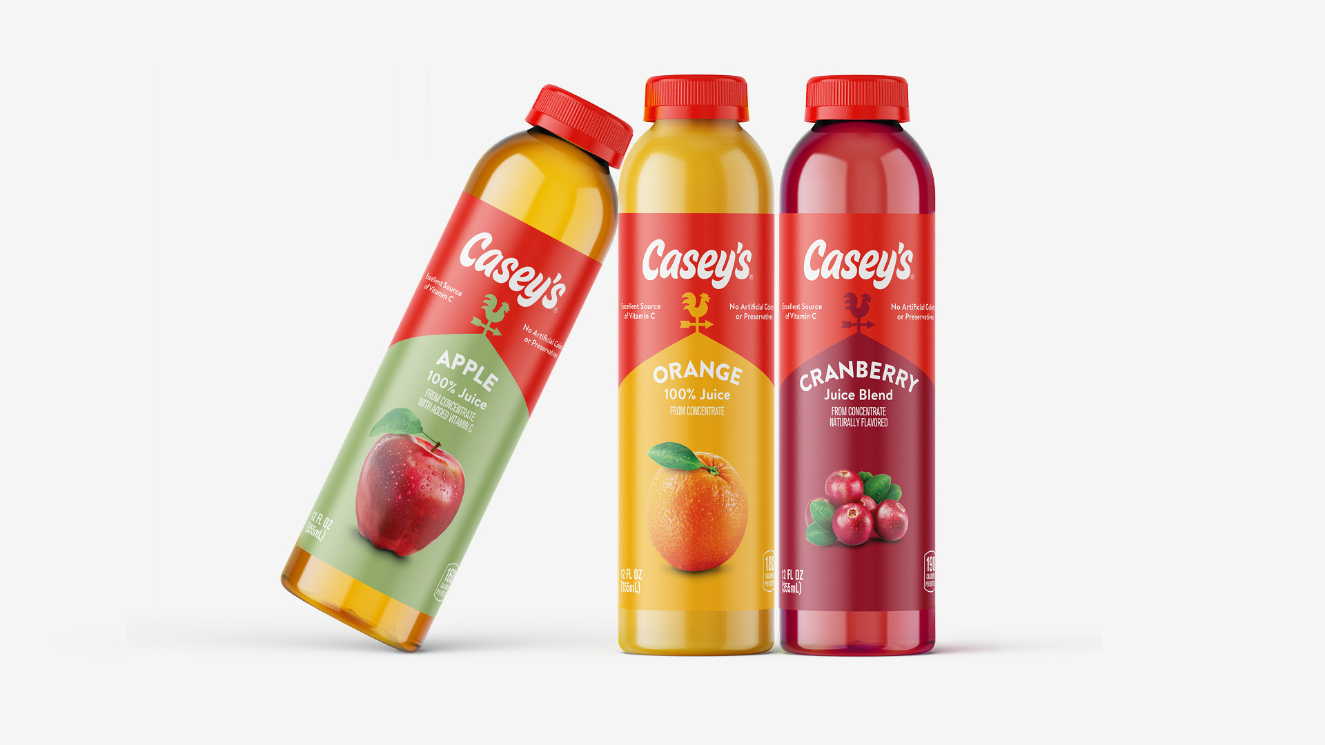
While the full brand roll-out will be a multi-year process to update 2,200 stores, one of the first instances of the new identity was the expansion of Casey’s private label brand.
Interbrand partnered with the Casey’s team and various vendors to bring a hundred private label SKUs to market at the same time as the brand refresh. In order to create an adaptive system that could stretch across the varied line of products, we restructured the core elements of the logo into a bold graphic design language. The flexible system is now being extended across the wider experience including signage, uniforms, app, livery, and to-go packaging.