AtkinsRéalis
Uniting gamechangers for tomorrow’s engineering challenges
Uniting gamechangers for tomorrow’s engineering challenges

In today’s interconnected world, tackling the global challenges of how humanity is housed, connected, powered and protected requires not just skill, but radical collaboration. It calls for the brightest minds to come together, pool their expertise, and innovate like never before.
This was the ethos that SNC- Lavalin, a global engineering leader, had begun to realise through a transformation of their business.
The changes had left their old brand behind. We worked with the business and a selection of creative collaborators to create a new name, brand and identity designed for their future.
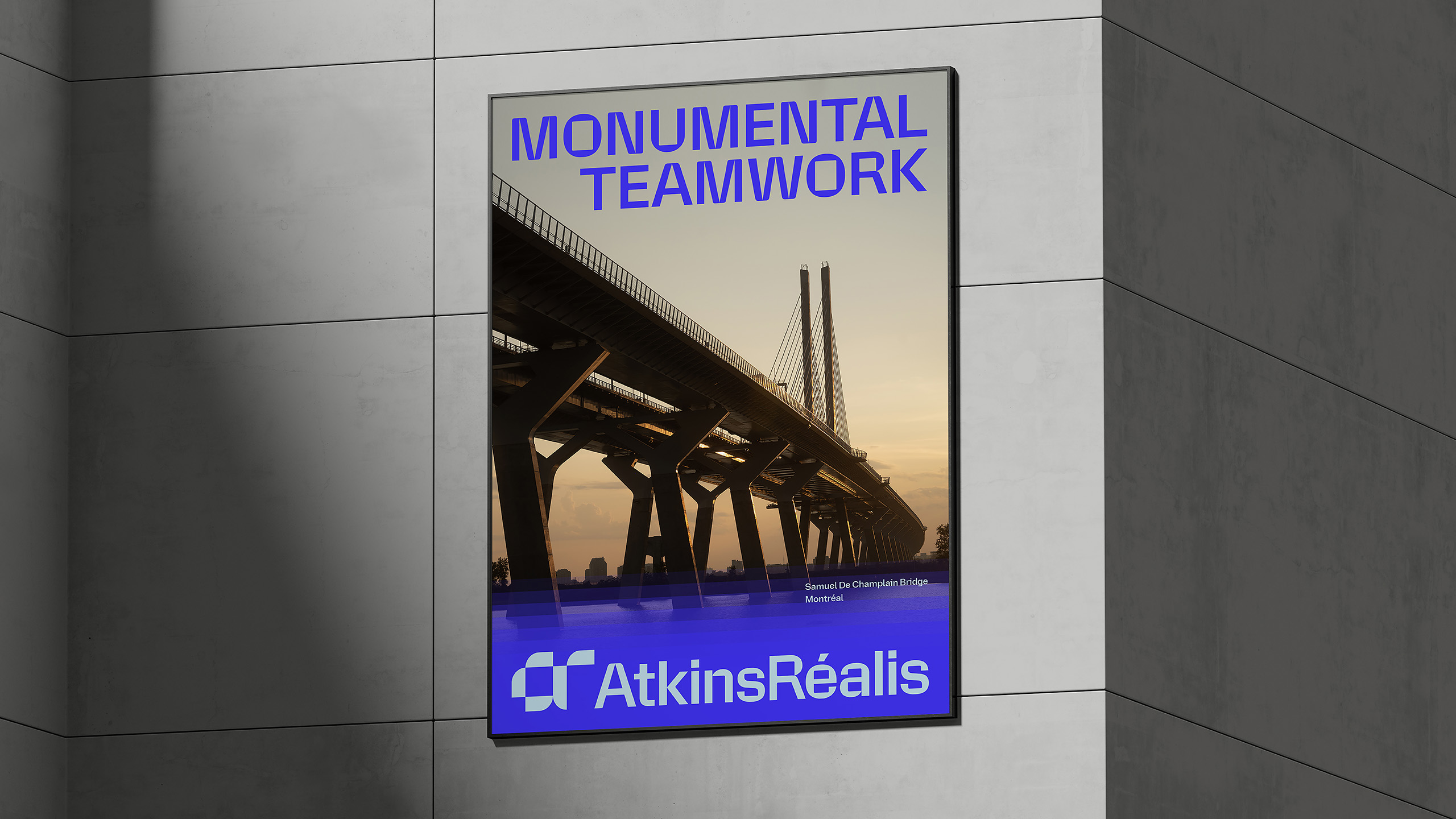

SNC-Lavalin have been at the forefront of creating iconic infrastructures across 160 countries, including developing the design for Crossrail’s central section through London and the designing and construction of the Burj Al Arab in Dubai.
With a workforce of over 36,000 and its roots in Montreal, the company boasts a legacy spanning over a century. Yet, it faced numerous challenges including a fragmented experience for its clients due to its multiple sub-brands, including Atkins, Faithful+Gould, DTS and Atkins Acuity.
By unifying their many brands they could symbolise the power of collaboration and the collective.
The new name “AtkinsRéalis” merges the renowned Atkins brand with “Réalis” inspired by Montreal’s French-Quebecois heritage and meaning “to make happen” in French. This aligns seamlessly with the brand’s forward-thinking approach, calling people to join, collaborate, and shape a brighter future for our planet and us all.
The new identity introduces flexible elements designed to tell the story of collaboration and stand out in the industry.
Monogram
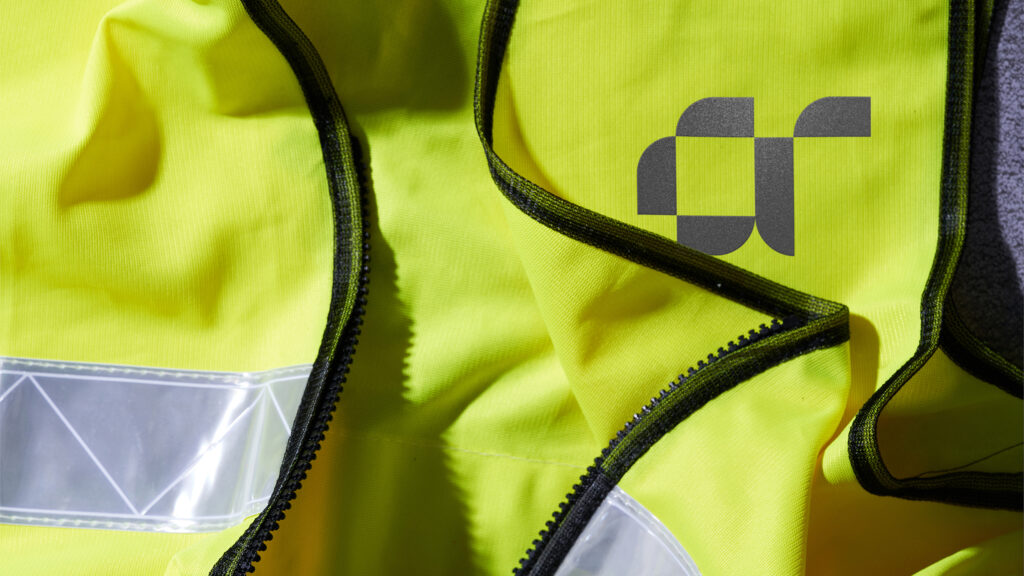
At the heart of the monogram lies a meticulous assembly of shapes that cluster around a central core. It’s more than just a coming together; it’s a celebration of precision, craftsmanship, and technique.
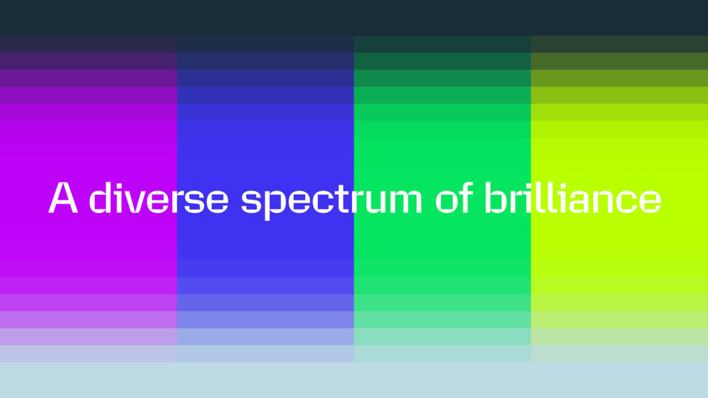
When brilliant people come together, you can feel the chemistry in the room. Bouncing ideas off one another and making more of an impact than they could ever do alone. We’ve built the identity around brilliance — every element has been inspired by the idea of collaborative energy and the impact it can make.
Brilliance
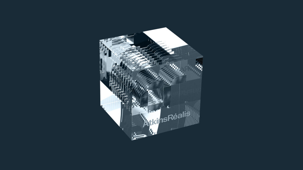
Every collaboration brings with it a unique energy. At the heart of the new brand expression is a flexible element, called brilliance, that offers a visual representation of this, showcasing layers of knowledge and expertise converging.
It’s not just about individuals coming together, but the chemistry that sparks when such brilliance finds a shared purpose.
Colour
Breaking away from the monotony, the new brand’s colour palette is anything but ordinary. Vibrant and bold, it evokes the brilliance of innovative thinkers.


Bespoke typography
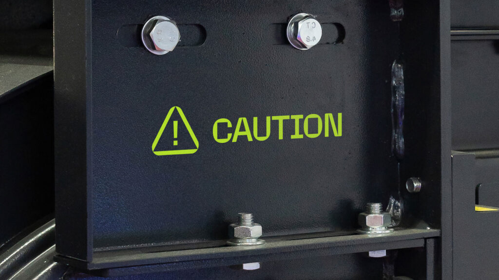
Our engineered typography evokes the technical, precise nature of our work. With strong, structured forms that make it uniquely ours. We have two bespoke typefaces, Gamechanger and Bienvenue.
They are designed to work together, but each one has its own specific purpose. Two typefaces helps create distinct levels of type hierarchy, making information easier to navigate. And both have been developed as variable fonts, allowing fluid transitions in motion.
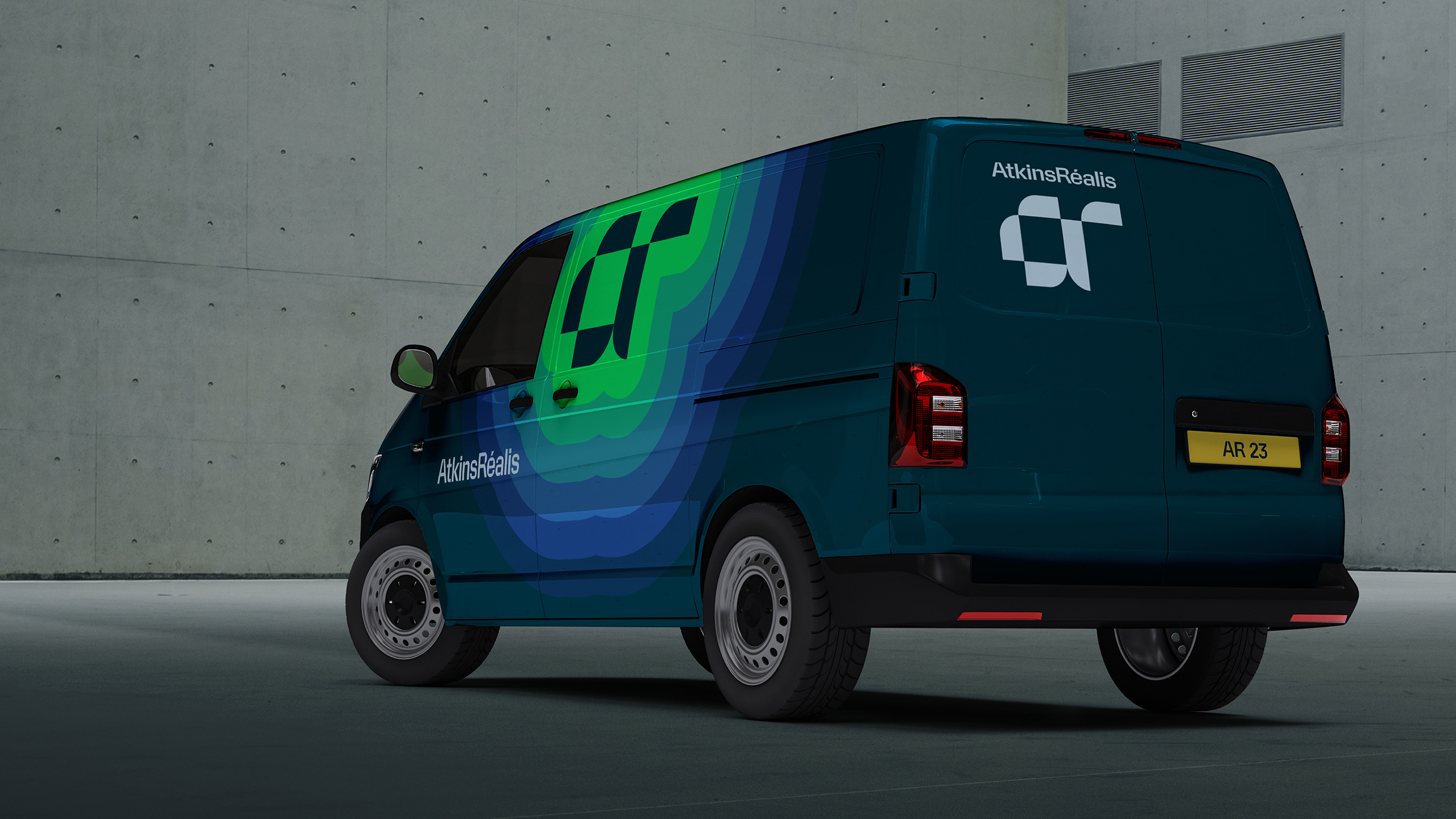
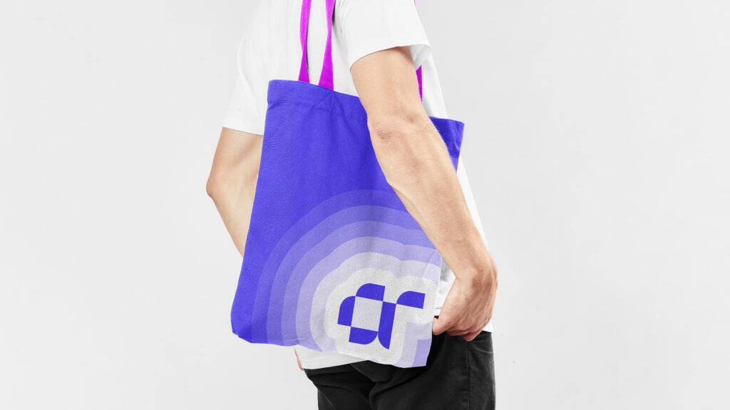
In September 2023, the new name and new brand was launched and rolled out globally — from guidelines to templates, vehicle liveries to office interiors and websites to signage.
It is uniting thousands of employees under a single global brand and instilling pride, signalling to the world they are a transformed company with a clear, and compelling strategic vision.


