News
Interbrand wins a Grand Prix at Red Dot Gala in Berlin
Interbrand wins a Grand Prix at Red Dot Gala in Berlin
Berlin
November 1st, 2024
Interbrand has been awarded a Grand Prix at the Red Dot Award: Brands & Communication Design gala, held on November 1st in Berlin.
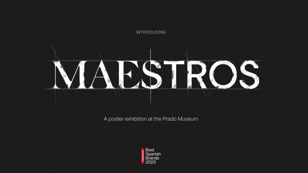
This award recognizes the originality and impact of “Maestros” (“Masters” in English), a campaign launched by the Madrid office for the publication of the Best Global Brands 2023 report, which highlights the 30 most valuable brands in Spain.
Borja Borrero, Executive Director of Interbrand, received the award on behalf of the creative team responsible for this project, which he led, and which was first unveiled last February at the Prado Museum in Madrid.
To create buzz among Spanish C-Suite and top leaders around the importance of brand valuation, Interbrand needed to break new ground and spark a meaningful conversation about brands’ capacity to produce preference, growth, and ultimately, value.
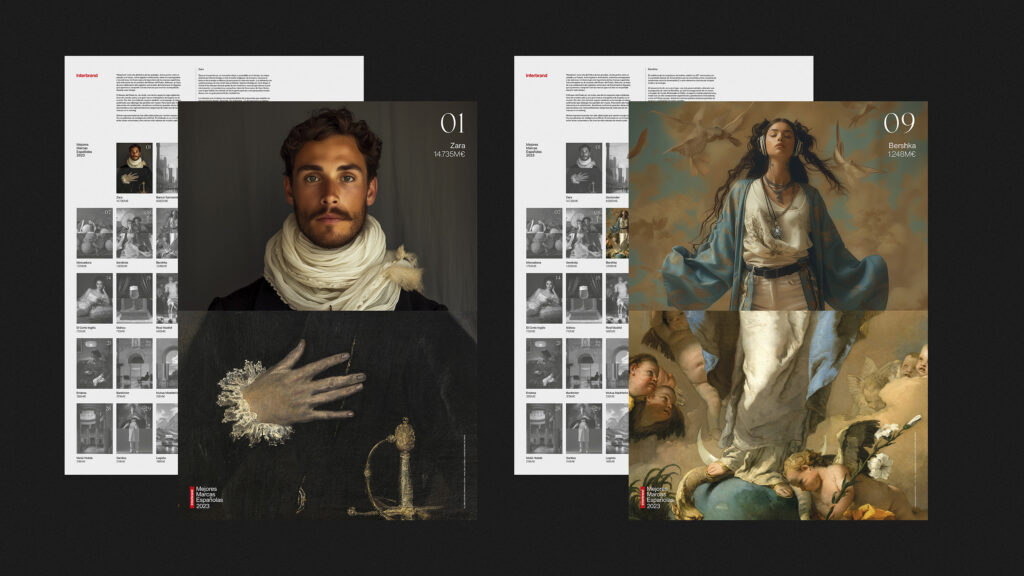
Having the Prado Museum in Madrid hosting the gala where the Best Spanish Brands report launch would be celebrated poised an incredible opportunity to leverage Spain’s 30 most valuable brands while confronting them with 30 iconic masterpieces.
The Prado Museum, an icon of Spain’s cultural heritage, served as the perfect backdrop for this event. The museum itself is a brand, as are the great ‘masters’ that inhabit its walls: Goya, Velázquez and El Greco among others. These masterpieces are part of the material and emotional heritage of the Spanish people, functioning as brands with an identity, imprint, and unique seal.
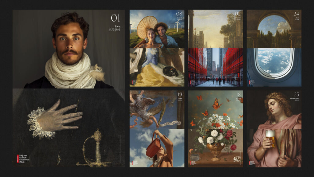
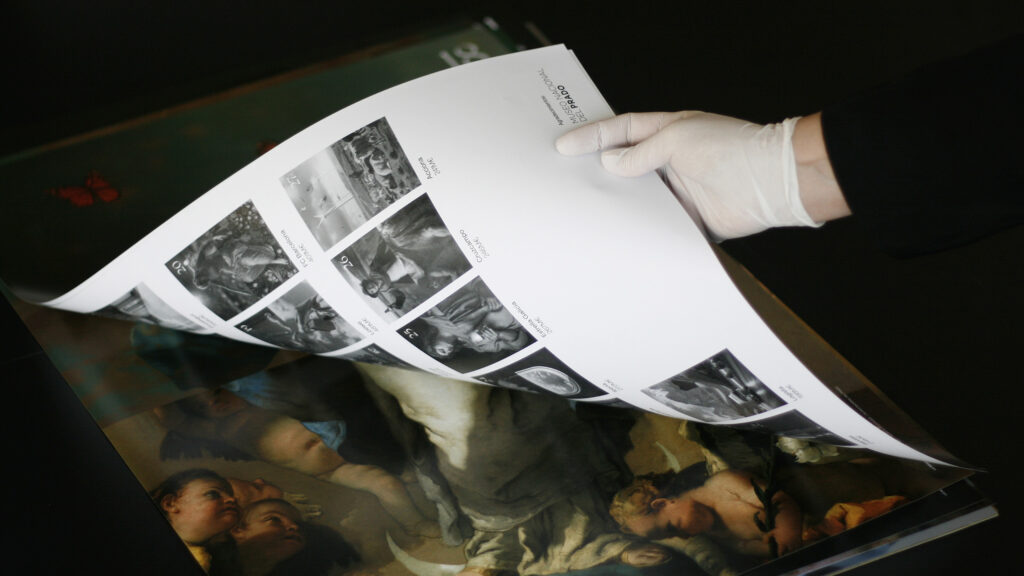
For this reason, the creative team started the project by delving into the vast archive of the Prado Museum, which consists of more than 20,000 works. An unparalleled wealth of content had to be revisited and meticulously scrutinized to select the 30 masterpieces that best reflected the spirit and nature of the Best Spanish Brands.
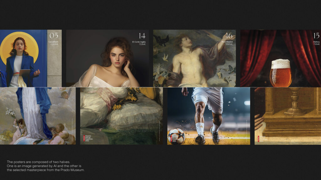
Then, using artificial intelligence (AI), Interbrand generated different visual narratives to complement those masterpieces, resulting in a collection of 30 posters highlighting the value of the brands represented. Both AI-generated imagery and masterworks needed to be matched visually and conceptually, without losing sight of the message we wanted to convey for each brand.
The use of AI was not arbitrary; it represented the coexistence between the artisanal and the digital, the past and the future. This integration emphasized the coexistence between culture and art, and the financial value of brands, which is the essence of Best Spanish Brands. Different techniques were united in a single representation—a classical pictorial technique with a contemporary technique such as AI. If in the Renaissance reality was interpreted by the hands and skill of the master, today AI reinterprets a compendium of visual archives into realistic or abstract images.
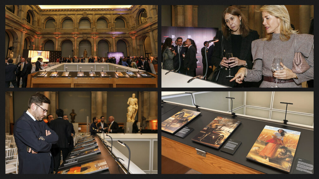
The 30 resulting posters were displayed at the Cloister of Jerónimos at the Prado Museum during the Best Spanish Brands Gala on February 29th, 2024. It was exciting to see the reactions of clients as they walked through the exhibition, finding their brands represented in such ways. The setting and context were so grand that one could feel their sense of amazement. Each work was treated with the utmost respect, valuing both the original piece and the brand while avoiding any negative or disrespectful connotations. The board of directors at the museum was impressed enough with the idea to request keeping the displayed works in their archive.
The 30-poster collection was also used to present the ranking on our website as well as is social media. Finally, Interbrand sent complimentary and personalized framed posters to each brand (CMOs and CEOs), and received numerous congratulations from clients, prospects, influencers and journalists, who were impressed by the originality and craftsmanship of the exhibition.

Ultimately, ‘Maestros’ is truly an ode to beauty, a reflection of how humans pursue excellence, communicating with the world through beautifully crafted artworks that ultimately generate value. It’s clear proof of the power of art and creativity combined to inspire, unite, and ultimately create value for the world through brands and branding.
Read more about all of the Red Dot 2024 award-winning words here.
Contact
Tina Goldstone
tina.goldstone@interbrand.com
About Interbrand
Interbrand has been a world leading brand consultancy for five decades – having pioneered iconic work and forged many of the brand building tools that are commonplace in across the industry today.
In collaboration with the world’s leading brands, Interbrand’s global team of Thinkers and Makers are pioneering the future of brand building.
Utilizing three lenses, that take into consideration Human Truths (a deep understanding of the consumer), Brand Economics (the financial forces driving a brand’s success), and Experiences (the creative interface between business operations and customer needs and desires), Interbrand give their clients the confidence to make Iconic Moves – sparking desire, creating utility, and driving extraordinary results.
Interbrand is a part of Omnicom’s (NYSE:OMC) Brand Consulting Group.