
Interbrand wins 17 Red Dot awards, including two Best of the Best distinctions for its work for Peace One Day and Truist
New York, (September 21, 2021) – Interbrand, the world’s leading brand consultancy, has won 17 accolades in the prestigious Red Dot Design 2021 Award competition. The wins include two Red Dot: Best of the Best awards for the corporate design and identity of Peace One Day, as well as for Truist’s typography.
“I am very proud that 17 shining examples of our work were recognized in the Red Dot Awards 2021 competition. With the wins coming from brands in travel and hospitality to technology and investment, we are seeing that brands in traditional sectors are diversifying to wider arenas to create greater differentiation and relevance. Congratulations to our New York, São Paulo, Tokyo, Seoul and London teams,” said Interbrand Global Chief Creative Officer Andy Payne.
Since 2002, a total of 62 awards have been granted to Interbrand – 57 Red Dots and five Red Dot: Best of the Best distinctions. From strategy to implementation, Interbrand guides major brands effectively through Iconic Moves, which change perspectives and promote corporate growth. These outstanding successes, proved why Interbrand won the honorary title Red Dot: Agency of the Year 2020.
Red Dot is internationally recognized as one of the most sought-after seals of quality for excellence in design. The Red Dot: Best of the Best award is granted only to projects with the highest quality of design and creativity. The 2021 winners will be published on www.red-dot.org on November 12, 2021.
The 17 wins featured:
Best of the Best
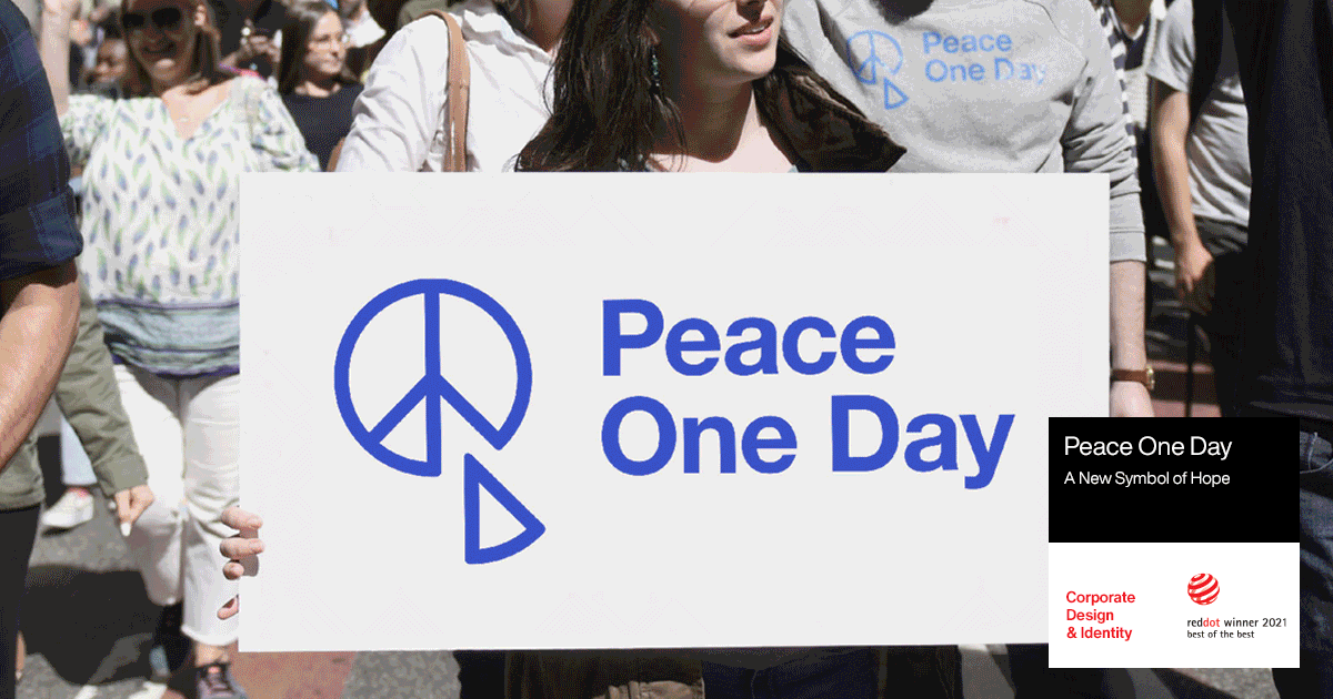
Peace One Day: A New Symbol of Hope
Corporate Design & Identity
Interbrand New York created a new logo and visual identity with the aim of reinventing the universal symbol of peace. The new logo is a 21st evolution of the globally recognized peace symbol, reworked to remove a slice of the original motif. The new visual and verbal identity system renewed the organization’s commitment of peace to all, and to become an even more recognizable and actionable movement.
Truist Trio Typeface
Typography
Truist aims to make impact by leading with purpose and delivering a financial experience that balances personal touch and advanced technology. Our team in New York worked with them to define this new brand—its strategy, story, name, and identity. Truist Trio, the proprietary typeface, rounds out the toolkit for the new brand. It was designed to be fluid and intuitive to read, with a bit of the expressive flair and warmth that define the brand.
Red Dot Awards
Truist Wealth: The Art of Design
Illustrations
Truist Wealth is the wealth management business of Truist Financial, the organization created from the recent merger between BB&T and SunTrust. Interbrand New York drew inspiration from the luxury and fashion spaces, who use art to evoke an experience, by developing an identity centered on custom artwork that could resonate with clients across ages, life stages, and industries. The glass look evokes the idea of seeing clearly through the complex to give a feeling of what clients can expect from Truist Wealth.
Corporate Design & Identity
Truist, the merger of SunTrust and BB&T banks, had ambitions to make financial services better. To do it, they needed an identity that was both trustworthy and visionary. The identity is focused on how Truist leads with purpose and delivers a financial experience balancing personal touch and advanced technology.
NielsenIQ: Illuminating Insights
Brand Design & Identity
“The price of light is less than the cost of darkness.” These words of founder A.C. Nielsen inspired the concept at the heart of the new NielsenIQ brand. Interbrand New York created an identity centered on a juxtaposition of light and dark to evoke the way the spin-off company illuminates the truth in data.
Brand Design & Identity
OnePlus had reached cult-brand status among media outlets and the tech community. Their next biggest ambition? To break through in the US market. Interbrand New York partnered with them to create a truly global brand, recognizing that with the commoditization of the mobile industry, it was an opportune moment for a brand-led company to break through
Corporate Design & Identity
Casey’s is a much-loved mid-western gas station chain that sits at the heart of the communities they serve. Interbrand New York’s role was to carefully update the brand to bring it in line with the new products and experiences that Casey’s now offers, while retaining its unique heritage.
LSEG
Corporate Design & Identity
When the London Stock Exchange Group acquired Refinitiv in 2020, it was a move that reshaped the industry and heralded the future of finance. Harnessing trust and open innovation, our team in New York drew equally from the two legacy brands, and created a compelling new identity for LSEG.
Connectivity Standards Alliance
Typography
CSA’s role is as a connector of ideas and people in the technology industry. It’s a place to share thoughts, speak to peers and grow important bridges between individuals and companies. To represent that spirit, we created the font ‘Assemble’, which has 127 unique ligatures that join specific characters together, instantly turning any headline copy into a simple, but powerful branded moment.
Connectivity Standards Alliance
Brand Design & Identity
Interbrand New York’s challenge was to create a new brand that could represent the Zigbee Alliance as the foundation and future of the IoT and as an organization with far greater reach and responsibility, enabling collaboration and innovation across the industry. Descriptive and rooted in “Connectivity,” the name positions the brand as caretakers of multiple standards.
Brand Design & Identity
Interbrand New York created the brand’s name, symbol and identity for Matter, a mark which seeks to clarify the interoperability of devices for the Internet of Things (IoT) and is likely to become as familiar as Bluetooth or Wi-Fi.
Cobras Brasil XV
Brands & Communication Design
Collaboration was fundamental throughout the construction process of the Cobras project, Brasil Rugby’s franchise at SLAR (Súper Liga Americana de Rugby). From the beginning, the challenge went far beyond a match or a uniform. The ambition was to transform Rugby into the new passion of Brazilians. And, to turn this game around, we internalized that this brand, far beyond the sport, is part of a lifestyle.
Brands & Communication Design
Explora was born from an impulse: to discover the marvels of the remotest territories in the world. With a new strategy that sheds new light onto exploration, the brand proves that outdoors is not the only setting for such activity. And so, the very definition of exploration has evolved, now including gastronomy, content, rituals, and many other factors involved in the whole experience, leading to a complete review of the brand’s journey and signatures.
Ryukoku University: Less Me, More We
Brand Design & Identity
Though Ryukoku University (Kyoto, Japan) had grown into a vibrant, international Buddhist institution, it struggled to communicate its relevance to tackling modern problems. With the concept “Less Me, More We”, we created provocative statements in bold, minimalist designs that suggest a sense of responsibility and urgency. We placed Ryukoku’s logo on the boundary line of each design, showing how the University is committed to providing active answers to today’s challenges.
SENSODYNE: Signature Signpost
Brands & Communication Design
Leading the sensitivity category, Sensodyne is a solution brand that needed to extend beyond just fixing. Sensodyne wanted to embrace all sensitivity pain avoiders and invite them to enjoy life again without sensitivity. The graphics evolved to introduce a bold new signature ‘S’ signaling relief and optimism. Moving towards a more daily, approachable, sensorial and importantly reassuring brand story.
Teum: Between ordinary and extraordinary
Brand Design & Identity
LG U+, one of the largest telco companies in South Korea, opened a new cultural complex called “Teum”, a Korean word that has a physical and conceptual meaning as a gap, or break. True to its name, this cultural space presents an unfamiliar, unique space in between our repetitive lives, providing activities and contents that suit various people and their tastes. By demonstrating the brand in a fun and creative manner, Teum maximizes its design identity by bringing out the customers’ curiosity.
Dare to achieve Genome & Company
Corporate Design & Identity
Genome & Company is one of the few companies in the world that develops microbiome-based immunotherapy. They needed to establish a clear brand identity to facilitate internal and external communication and enhance competitiveness. Inspired by the organic form of the strains, our team in Seoul created a world where microbiomes can be more approachable to ordinary people in an artistic matter.
CONTACT
Joe Stubbs, joe.stubbs@interbrand.com
About the Interbrand Group
Interbrand Group is made up of Interbrand, the world’s leading brand consultancy, and C Space, the global customer agency.
Interbrand have been a world leading brand consultancy, for over 45 years – having pioneered iconic work and forged many of the brand building tools that are commonplace across the industry today.
We know that in an age of unprecedented abundance of choice and speed of innovation, customers’ expectations are moving faster than business. While incremental change is still essential, it is no longer sufficient. It takes bold moves to leap ahead of customers and competitors. We call these moves Iconic Moves.
In collaboration with the world’s leading brands, our global team of thinkers and makers are pioneering the future of brand building. By turning customers into active participants, we help our clients strengthen their brands on an ongoing basis – our approach gives them confidence to make Iconic Moves that spark desire and create utility, driving extraordinary results.
Interbrand is a part of the Omnicom Group (NYSE:OMC). For more information, please visit www.interbrand.com
About Red Dot
In order to appropriately assess the great diversity of products and projects in the area of design, the Red Dot Design Award is divided into three disciplines – Red Dot Award: Product Design, Red Dot Award: Brands & Communication Design and Red Dot Award: Design Concept. With roughly 20,000 submissions, the Red Dot Award is one of the biggest design competitions in the world. 1955 marked the first year that a jury came together to evaluate the best designs of that era. In the 1990s, Red Dot’s CEO Prof. Dr. Peter Zec developed the name and brand of the award. Ever since, the prestigious distinction “Red Dot” has been a seal of outstanding design that is highly regarded internationally. The award-winners are presented in Red Dot’s yearbooks and museums as well as on the Red Dot website. Additional information can be found at www.red-dot.org