Bringing the outside in
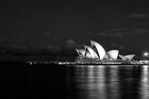
Sydney Opera House
Office: Sydney
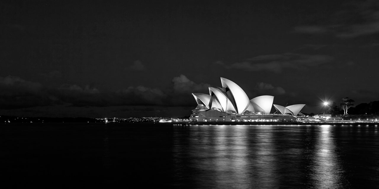
About to enter into a Decade of Renewal, the time was ripe to realign the organization around its original vision, and create a voice capable of uniting a diverse range of partners and experiences – from ballet and opera to tours and retail. In short, we needed to relook at the Sydney Opera House brand – and make it as iconic and inspiring as the building itself.
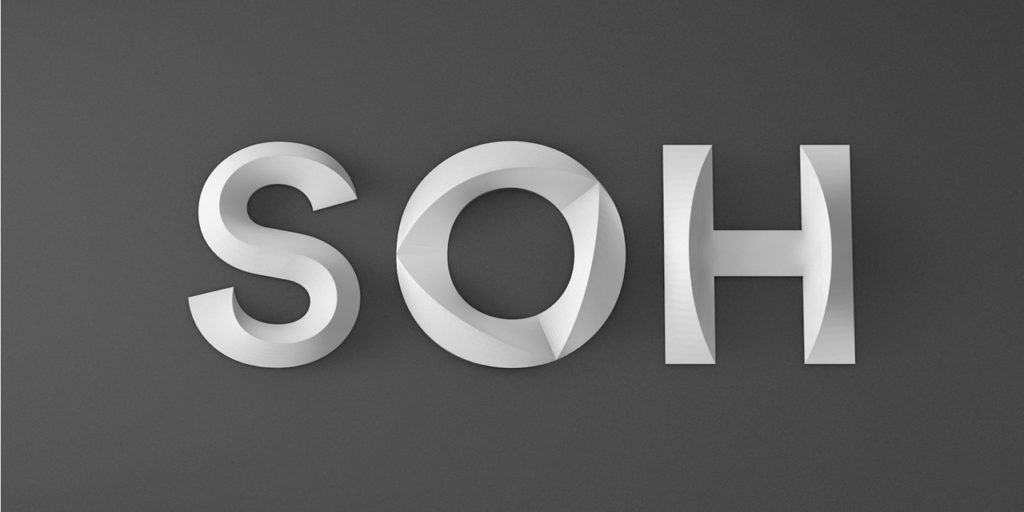
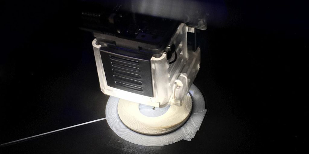
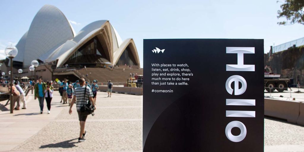
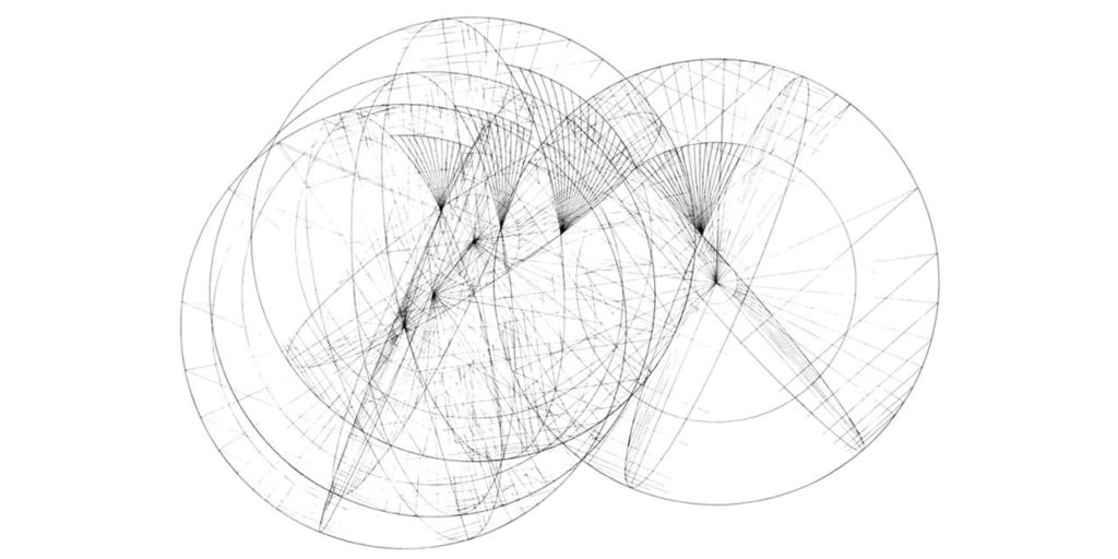
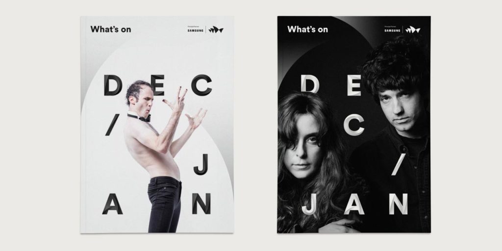
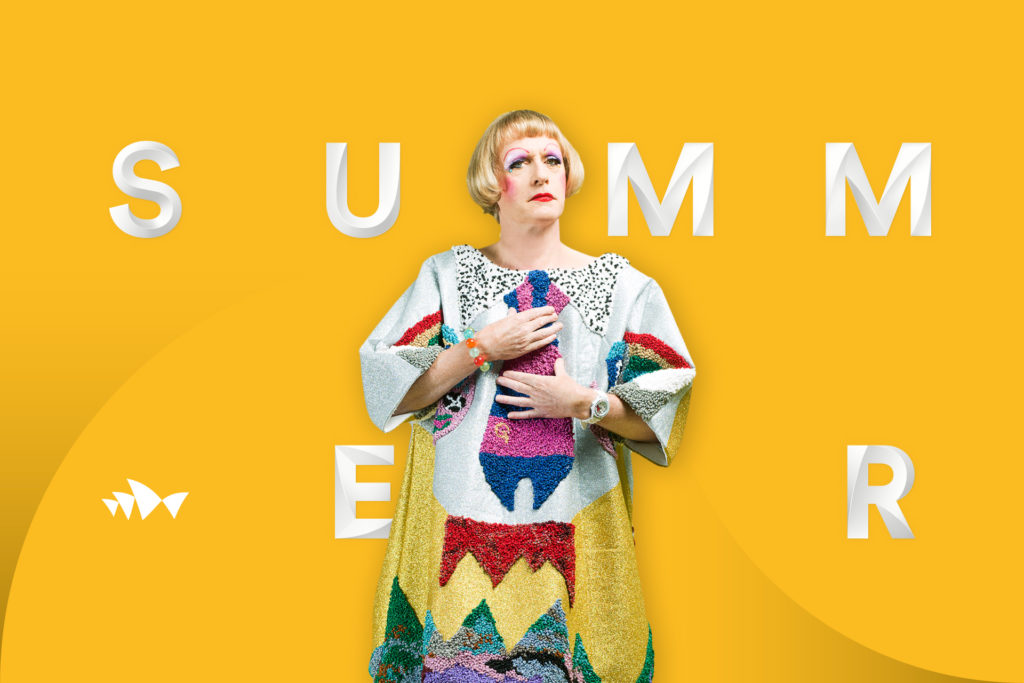
Working closely with the SOH team, we created an identity centered around the idea of Shifting Perspectives – positioning the Sydney Opera House as a place where you can take in a spectacular horizon, then broaden yours. At its heart is a sculptural form language. Reflecting the striking contours of the building, it complements the content of any performance or show, before bringing the attention back to where it belongs – the house.
In 2017, just a year after the new brand launched, 10.9 million (+33%) people had ventured inside the building. A year after that, Sydney Opera House generated 2% more operating revenue through its own activities. The new brand delivered exactly what it set out to do: bring visitor attention back to where it belongs, the arts.
Interbrand Australia won a GOLD lion in the 2016 Cannes Design Lions, Typography category for our work with the Sydney Opera House.
Shifting Perspectives was created by:
Interbrand Australia
In partnership with:
Studio Laurenz Brunner (Typography)
Collider (Motion)
DDB Sydney (Social campaign)
