
The rebirth of a Mexican icon: the brand strategy behind Banamex
“It wasn’t creating a new brand; it was relaunching a brand that still had a huge amount of equity for Mexicans.”
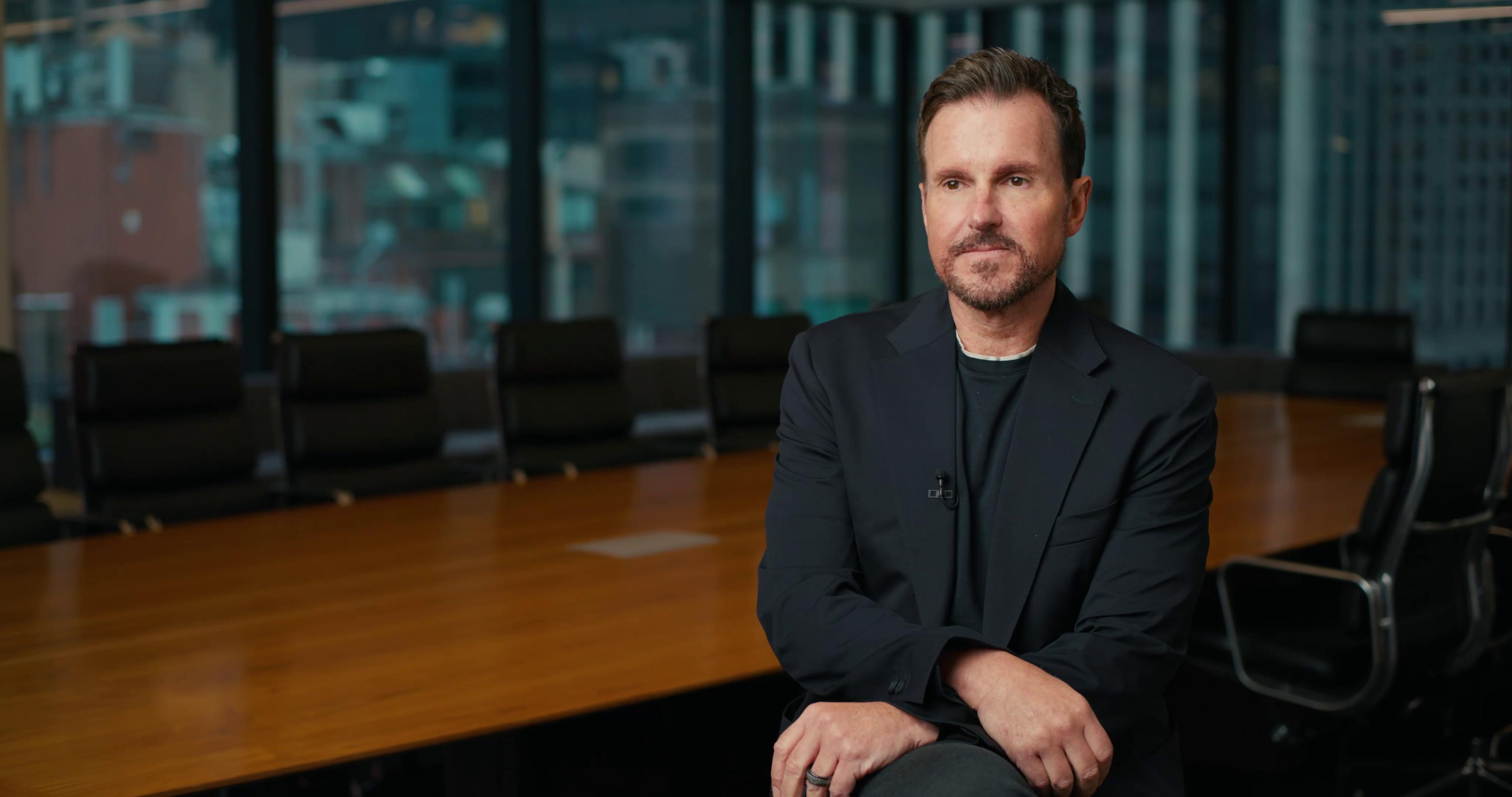
Sinead O’Connor, Head of Consumer Banking, Banamex
Few finance brands carry the emotional weight of Banamex (Banco Nacional de México). For more than 140 years, it has been part of Mexico’s economic history, serving over 20 million customers. So, when Citi made the strategic decision to separate its institutional and retail businesses in Mexico (then integrated under the Citibanamex brand), the challenge was to redesign and relaunch one of the country’s most iconic brands with the confidence, clarity, and cultural relevance to lead a new era.
That opportunity became the starting point for Banamex’s transformation. Working with Interbrand, the process started with a thorough diagnostic that spotted a lack of awareness among younger audiences. This key finding reframed the challenge and provided a clear, focused place to begin.
That opportunity became the starting point for Banamex’s transformation. Working with Interbrand, the process started with a thorough diagnostic that spotted a lack of awareness among younger audiences. This key finding reframed the challenge and provided a clear, focused place to begin.
The renewed Banamex brand strategy was built around a powerful idea: Aquí. Para ti. Siempre. Three words that capture permanence, proximity, and promise. They root the brand in its long-standing relationship with Mexico while opening it to the future with greater energy and relevance.
Visually, the transformation centered on one of Banamex’s most iconic assets: the Rosetta. Its strong recognition gave the brand a foundation to evolve without losing its familiarity. Interbrand helped evolve it into a more dynamic and flexible system, supported by an expanded color palette, a custom typeface, photography with unmistakably Mexican character, motion for digital environments, and even a refreshed sonic identity. The new brand feels alive where customers live today: on screens, in branches, at ATMs, and across every daily interaction.
Visually, the transformation centered on one of Banamex’s most iconic assets: the Rosetta. Its strong recognition gave the brand a foundation to evolve without losing its familiarity. Interbrand helped evolve it into a more dynamic and flexible system, supported by an expanded color palette, a custom typeface, photography with unmistakably Mexican character, motion for digital environments, and even a refreshed sonic identity. The new brand feels alive where customers live today: on screens, in branches, at ATMs, and across every daily interaction.
Just as important was the inside-out nature of this branding project. Banamex understood that authenticity would depend on alignment across the organization. As O’Connor put it, “it really needs to be connected in order to be authentic.” Nearly every stage of the process involved internal stakeholders, employees, board members, partners, and clients, making engagement a core pillar of the transformation.
Since its official launch in March 2025, the response has been exceptionally positive. A clear understanding of what Banamex represented and where it needed to go guided the process from start to finish, ensuring that every decision was made intentionally.
Since its official launch in March 2025, the response has been exceptionally positive. A clear understanding of what Banamex represented and where it needed to go guided the process from start to finish, ensuring that every decision was made intentionally.
More thinking from interbrand

Consistent brand investment is very important for the long-term health and value creation of your brand
How Qualcomm redefines B2B brand-building in the age of AI
Interview

Brands today are no longer built through media spend or visibility, they’re built through brave acts of leadership that uplift people’s lives.
Action over awareness: how UNICEF reimagines brand leadership
Interview

It’s really freeing to be able to focus on the long-term and the humanity of the brand, rather than the next new product.