Haleon
The worlds largest health care brand with humanity
The worlds largest health care brand with humanity
When GSK separated into two stand-alone businesses, our challenge was to create a new visual identity for the new consumer health division. This global business spans more than 70 countries, with 22,000-plus employees and an exceptional portfolio of category-leading brands such as Sensodyne, Voltaren, Panadol and Centrum. It’s launch presented a real opportunity to make a difference to the way billions of people engage with their everyday health, and had overwhelming employee acceptance.
Healthcare can be a crowded, confusing space. From Apple to Google, brands are vying for our attention at a time when healthcare systems are under significant pressure – presenting difficult decisions in many parts of the world.
What was clear to us was to increase the level of humanity in this fundamentally human-centric sector. And the urgent need to act.
Everyone deserves better everyday health. Yet the plethora of often-confusing healthcare information out there is far from inclusive or easy to navigate. Leaving space in the industry for a company and its identity to help more people access what they need.
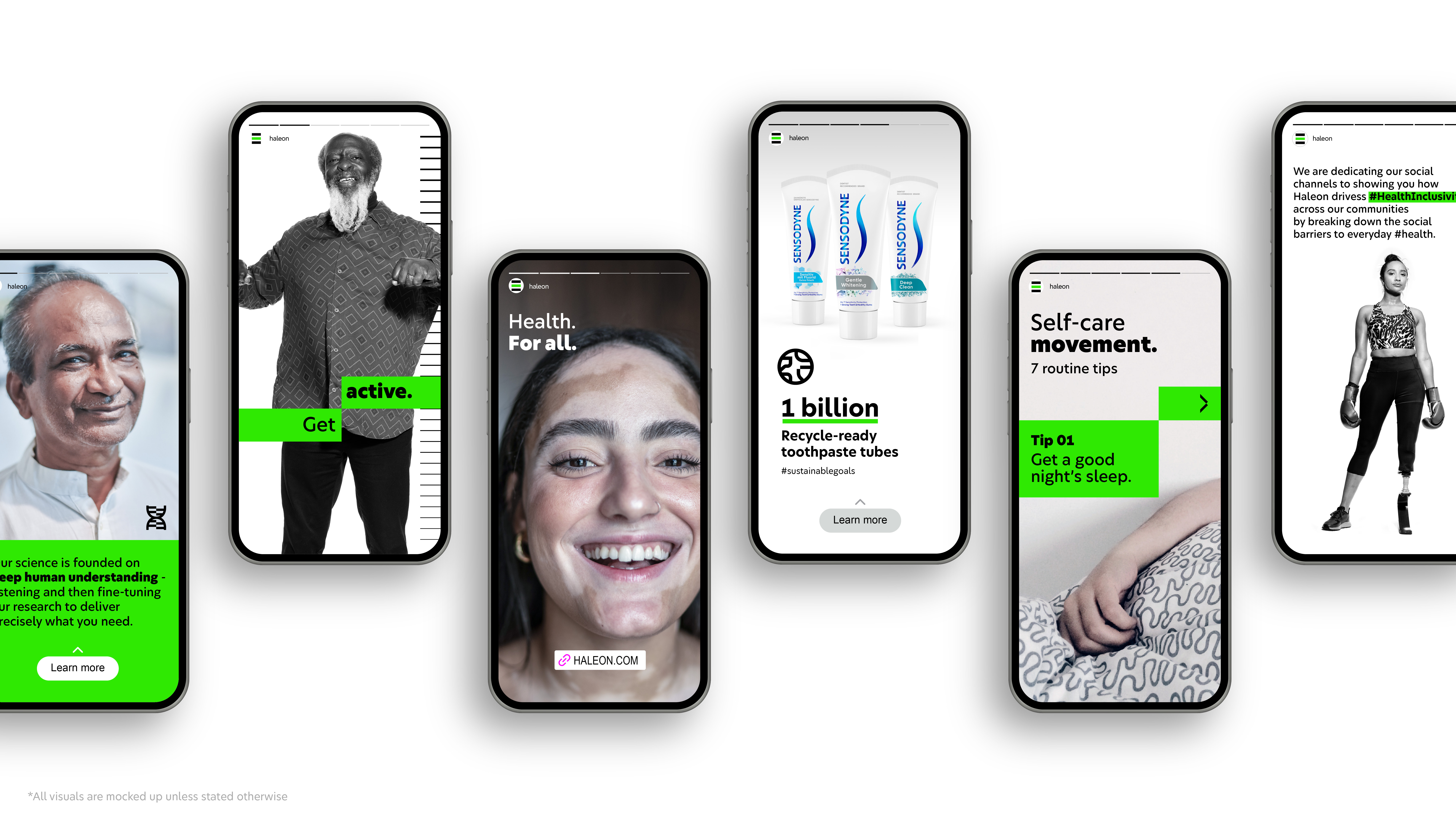
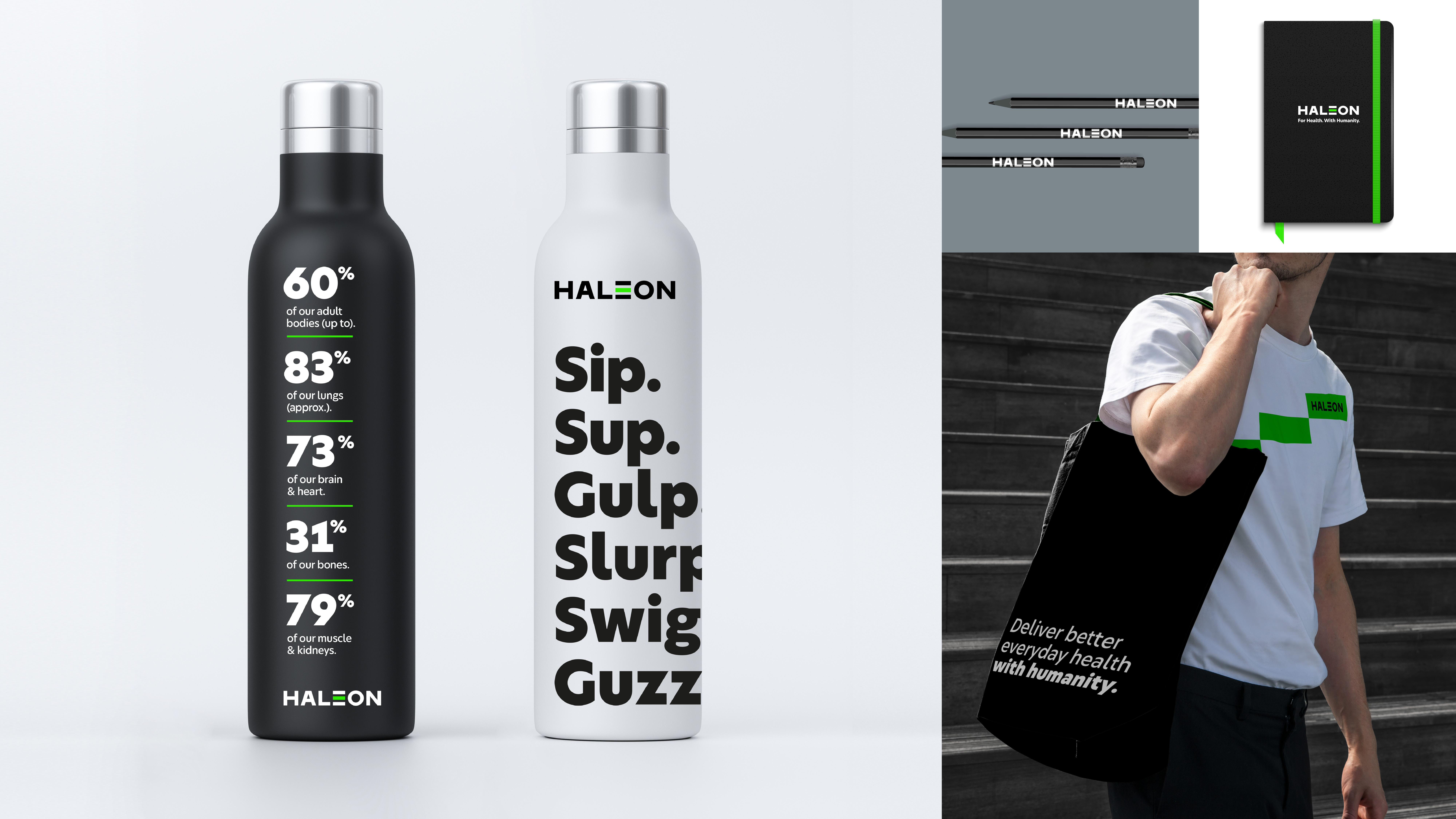
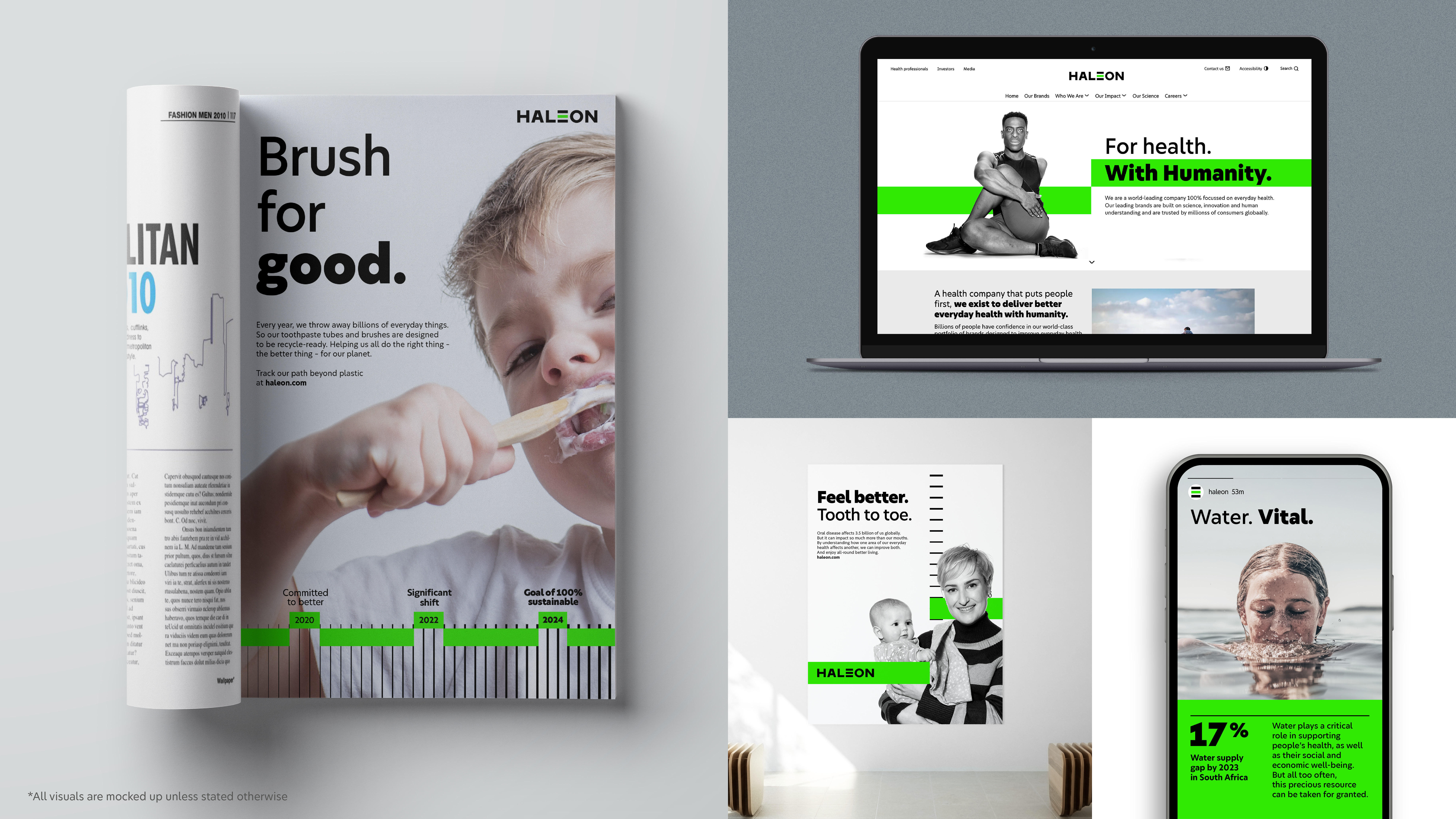
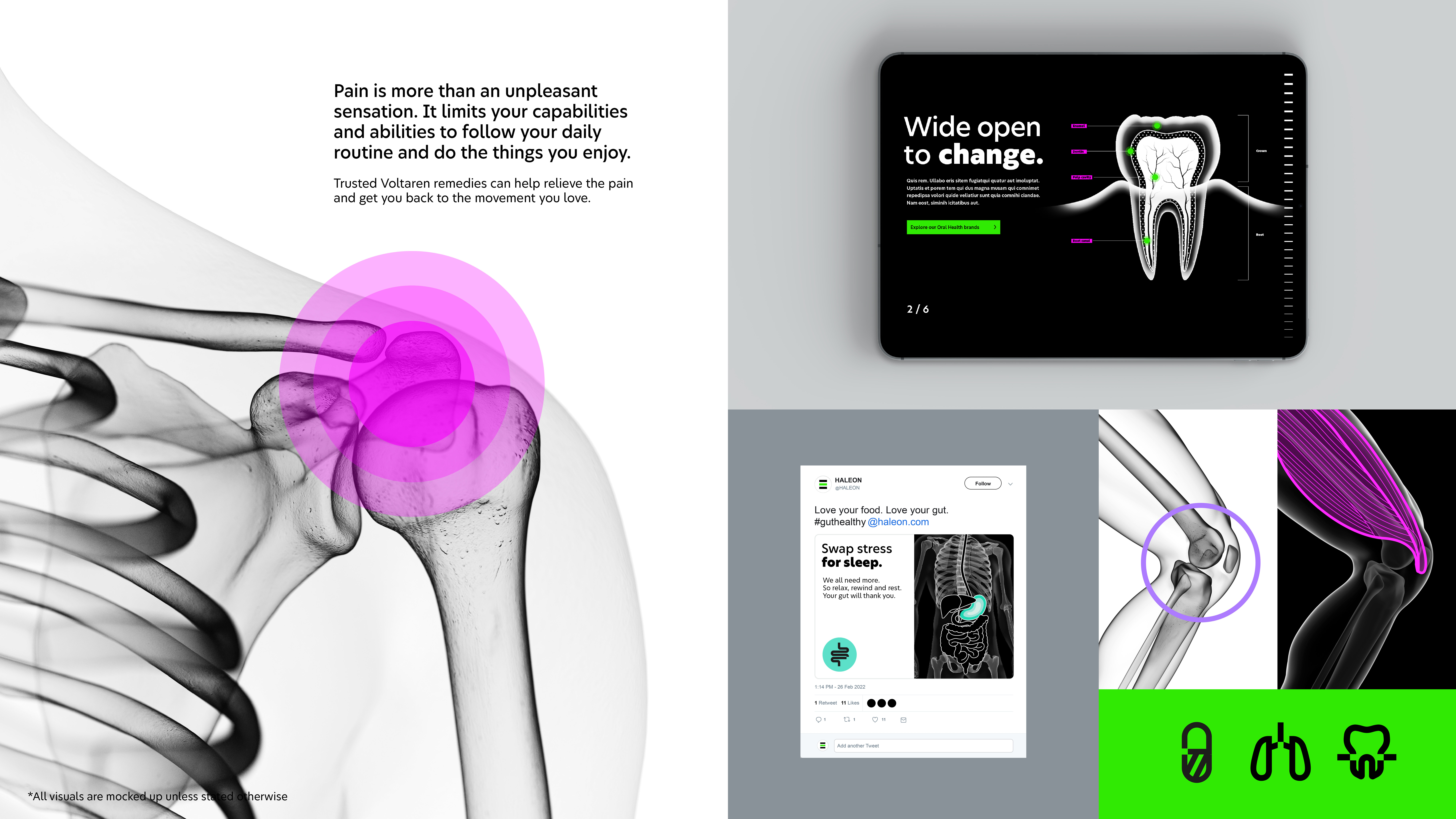
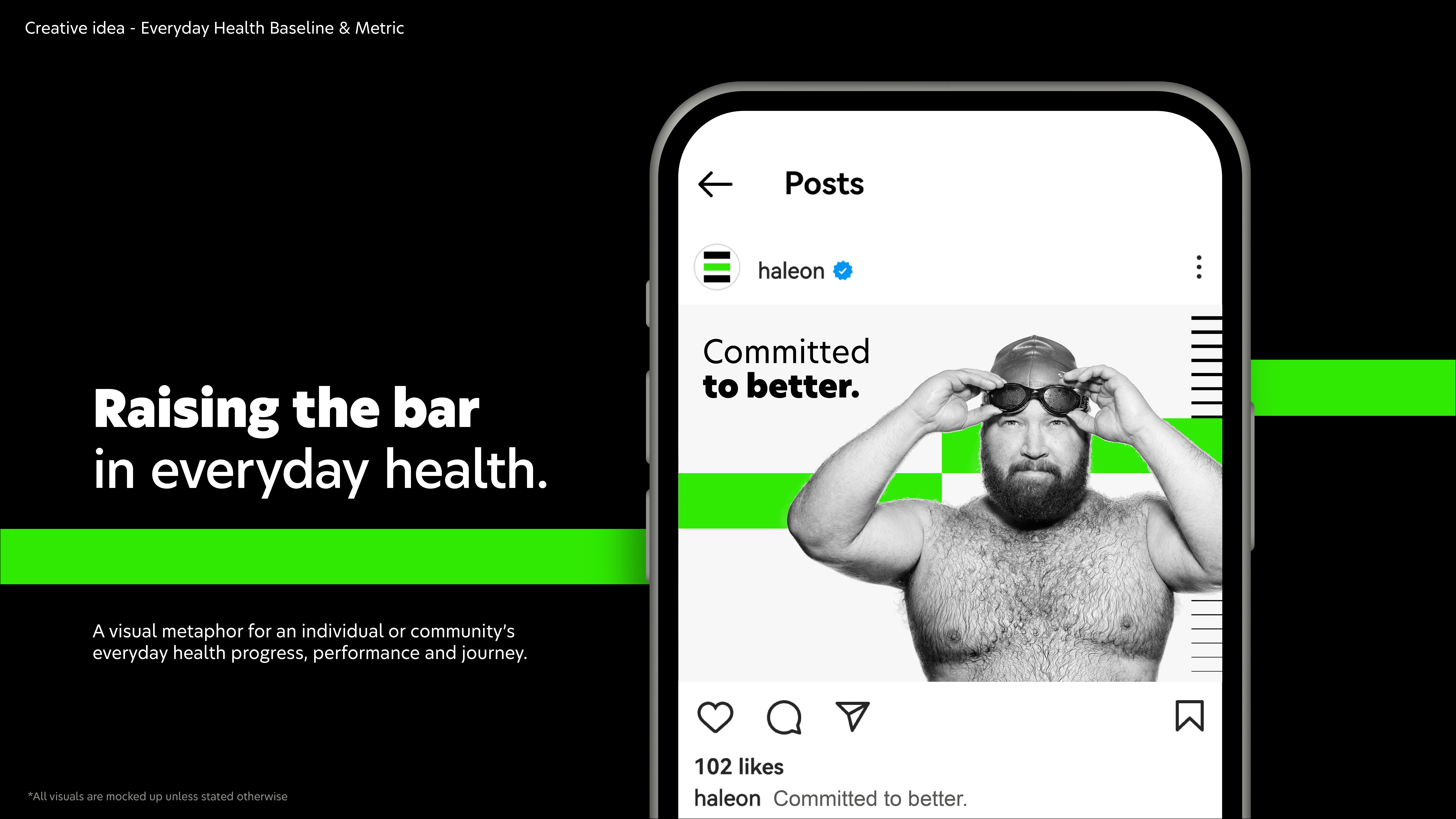
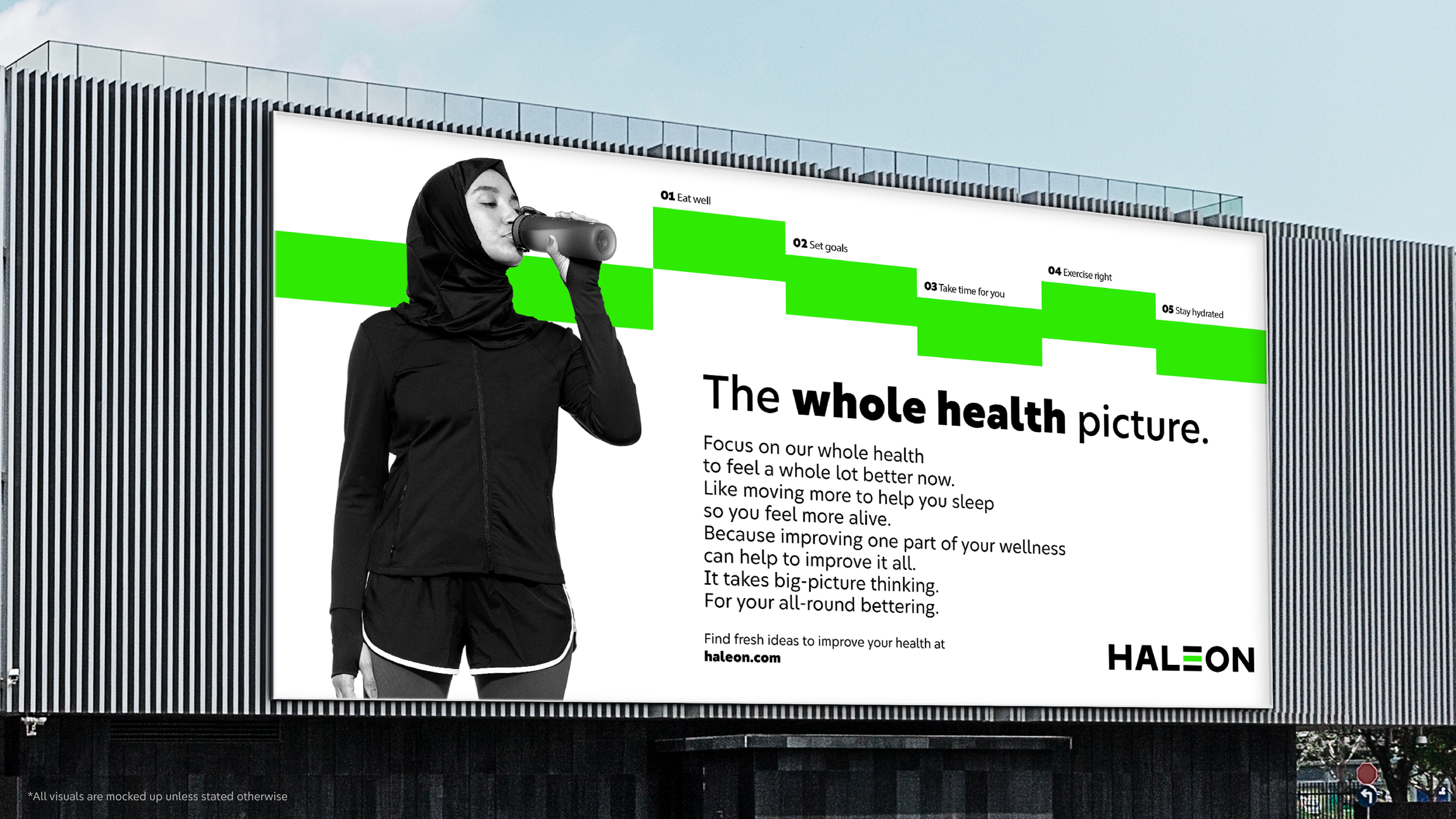
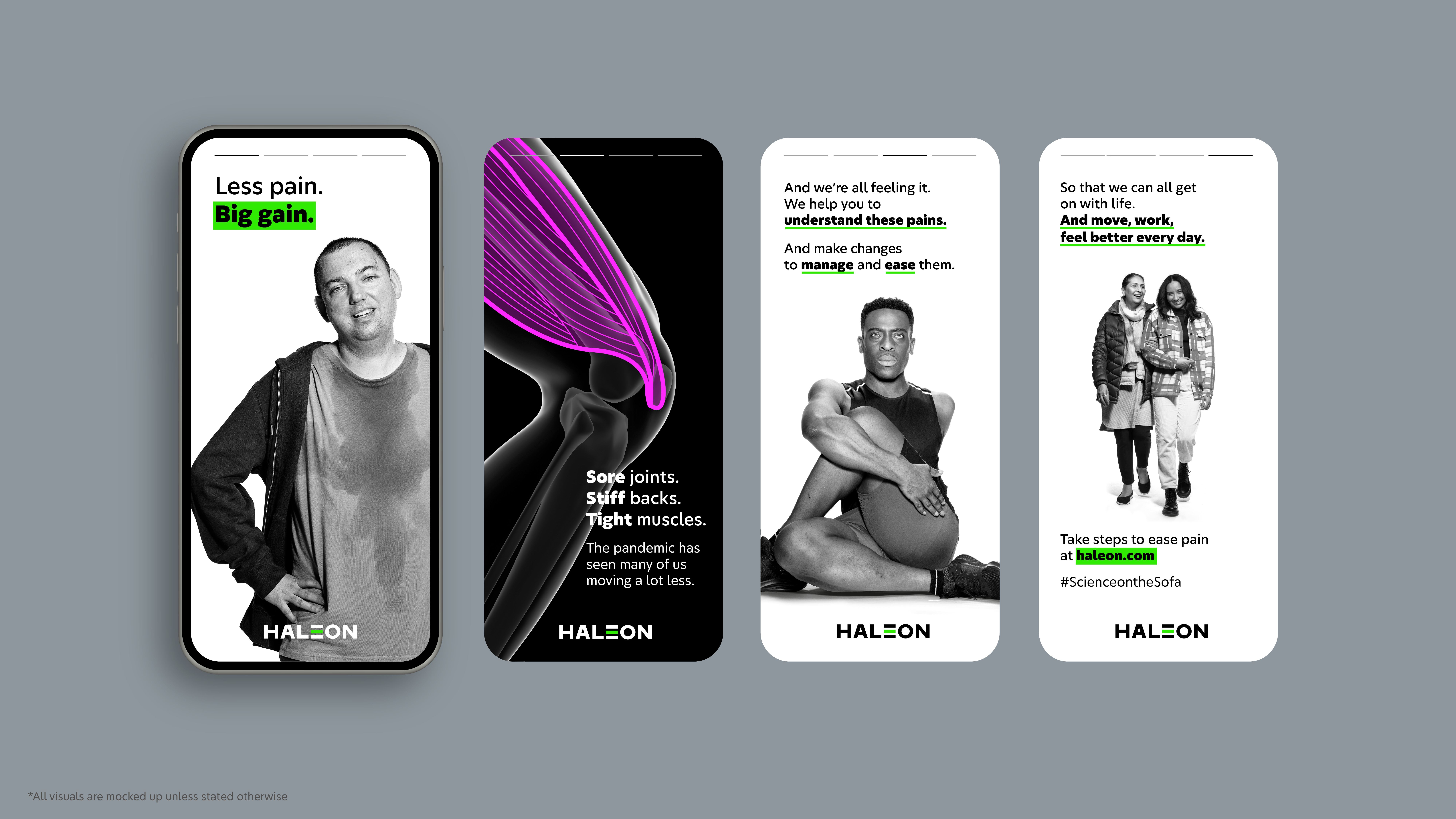
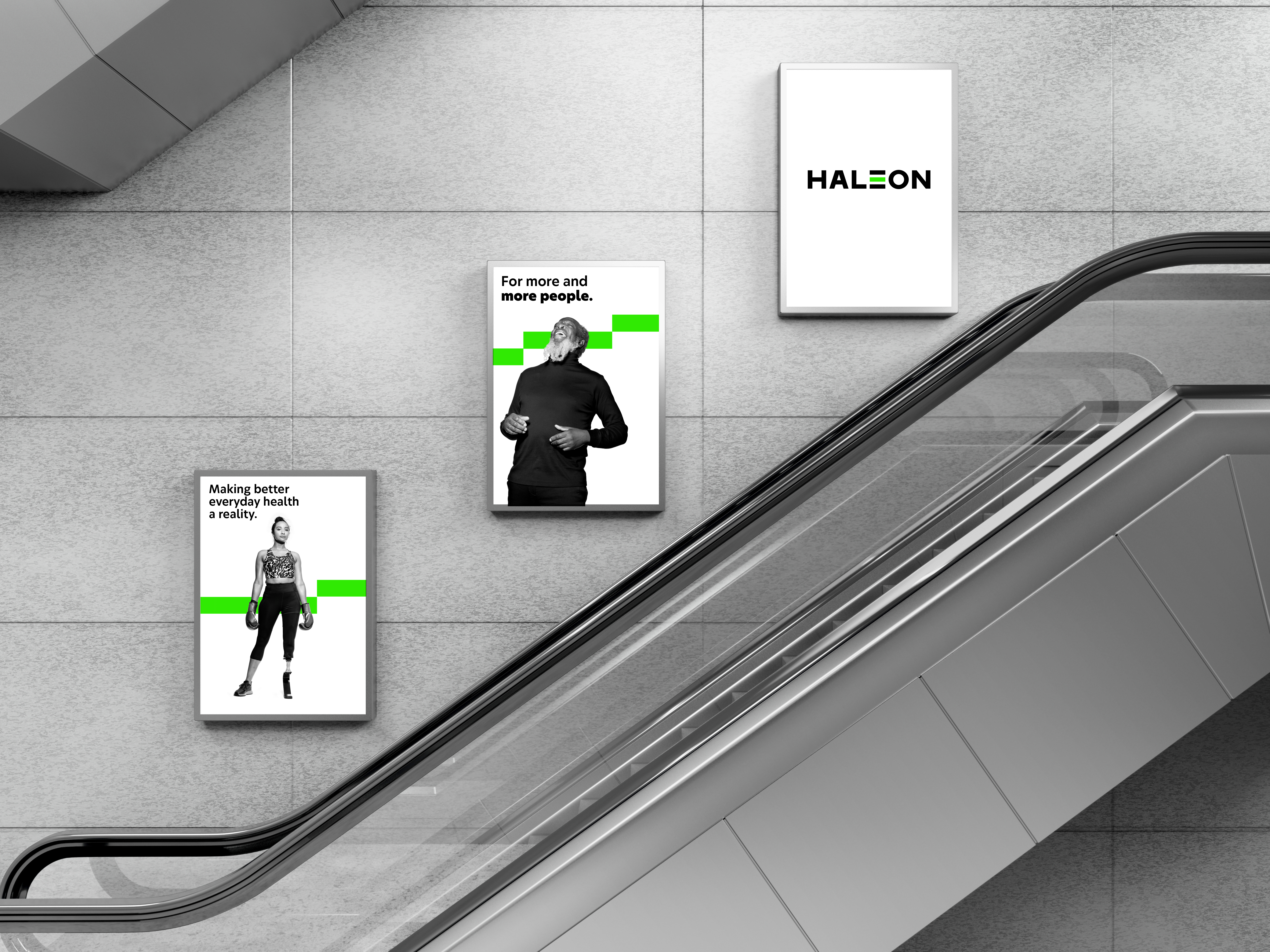
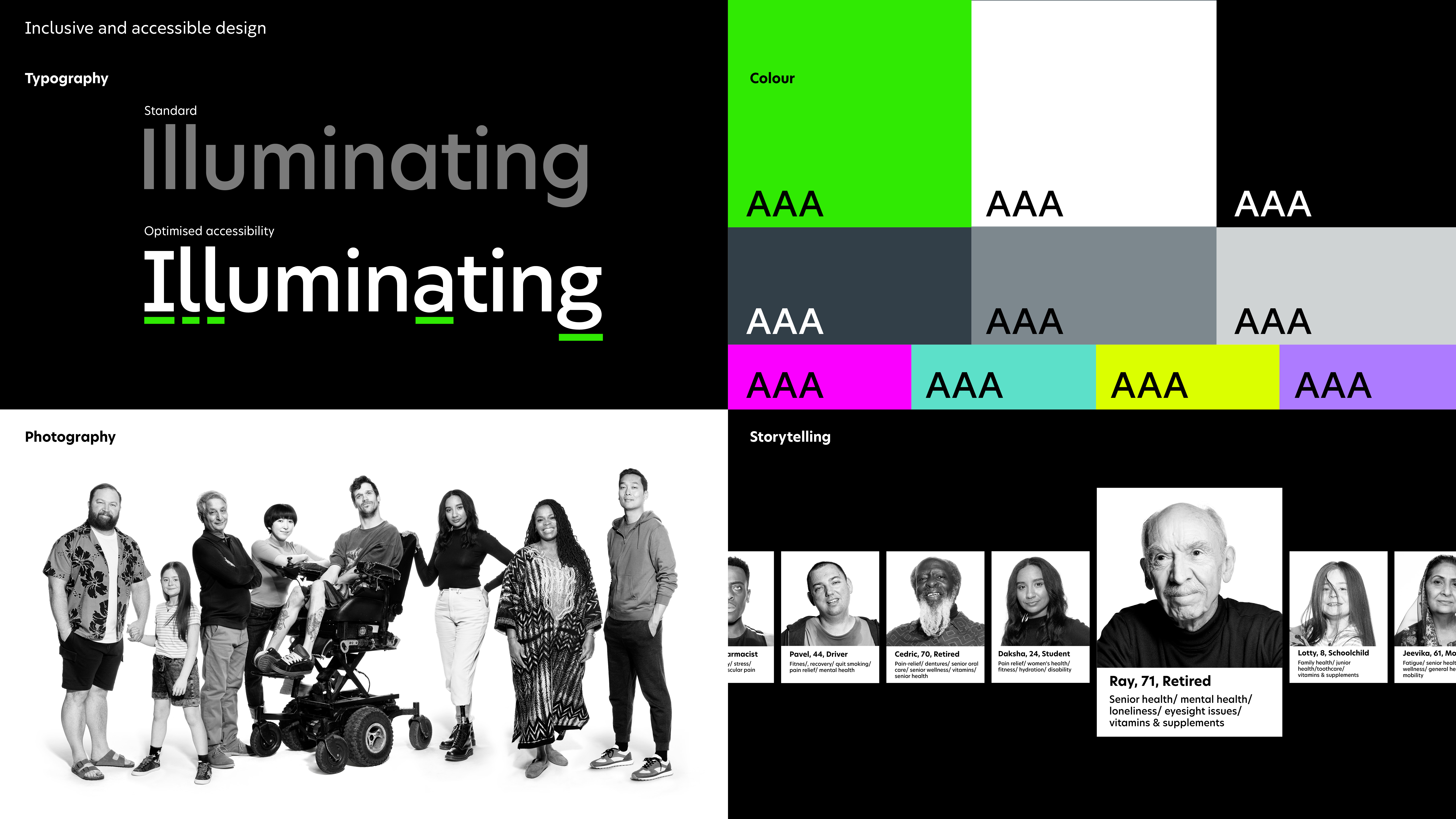
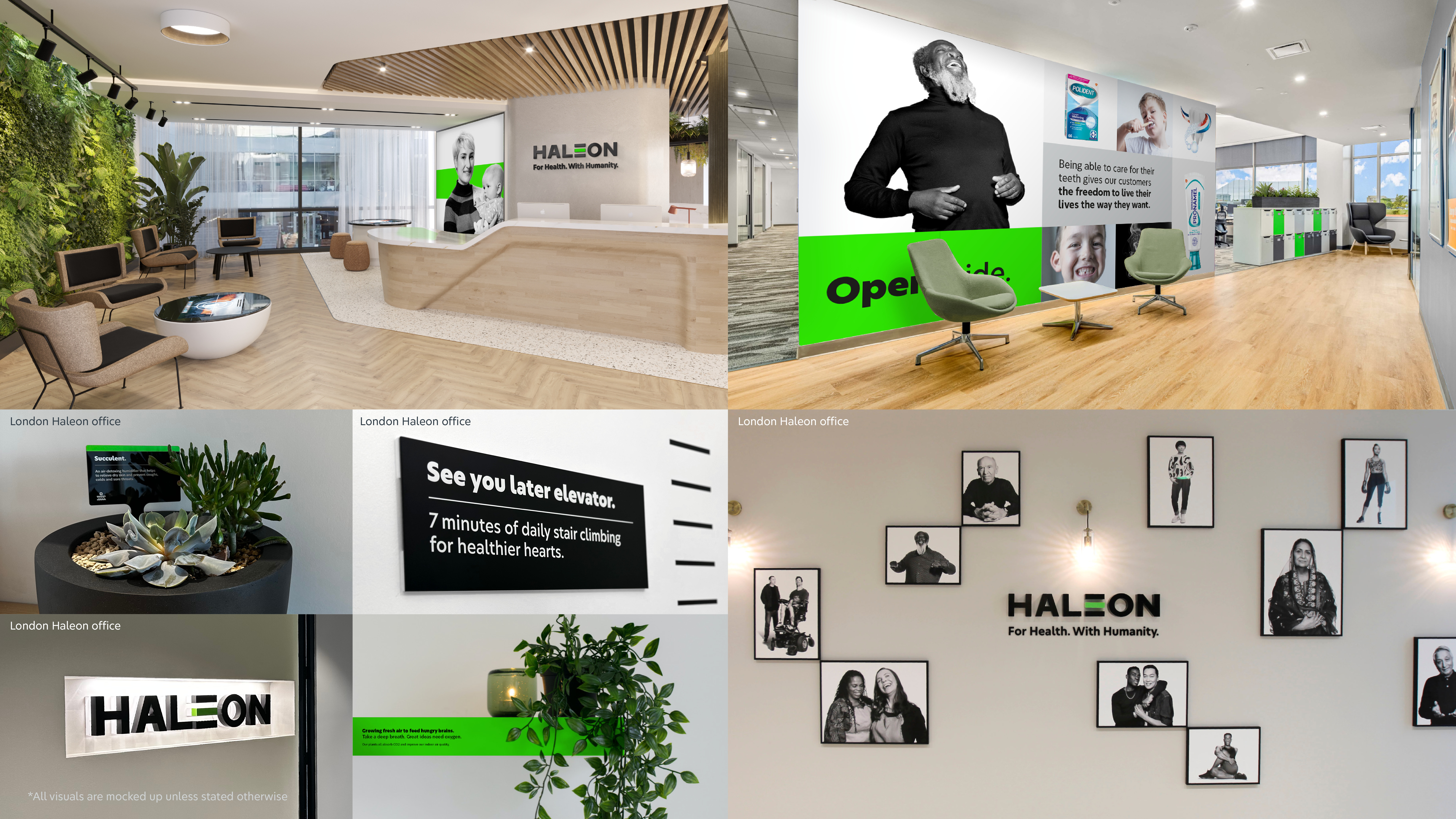
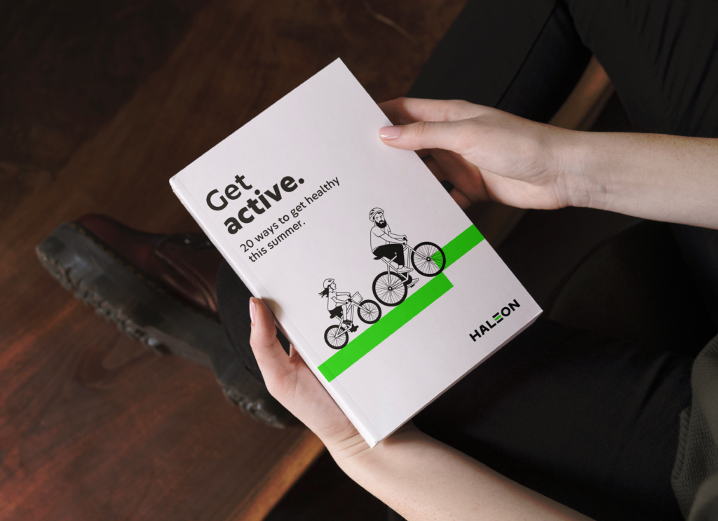
The creative idea was to raise the bar on everyday health, with stripped-back, fresh and modern design elements and a straight-talking, motivating voice that speaks to everyone.
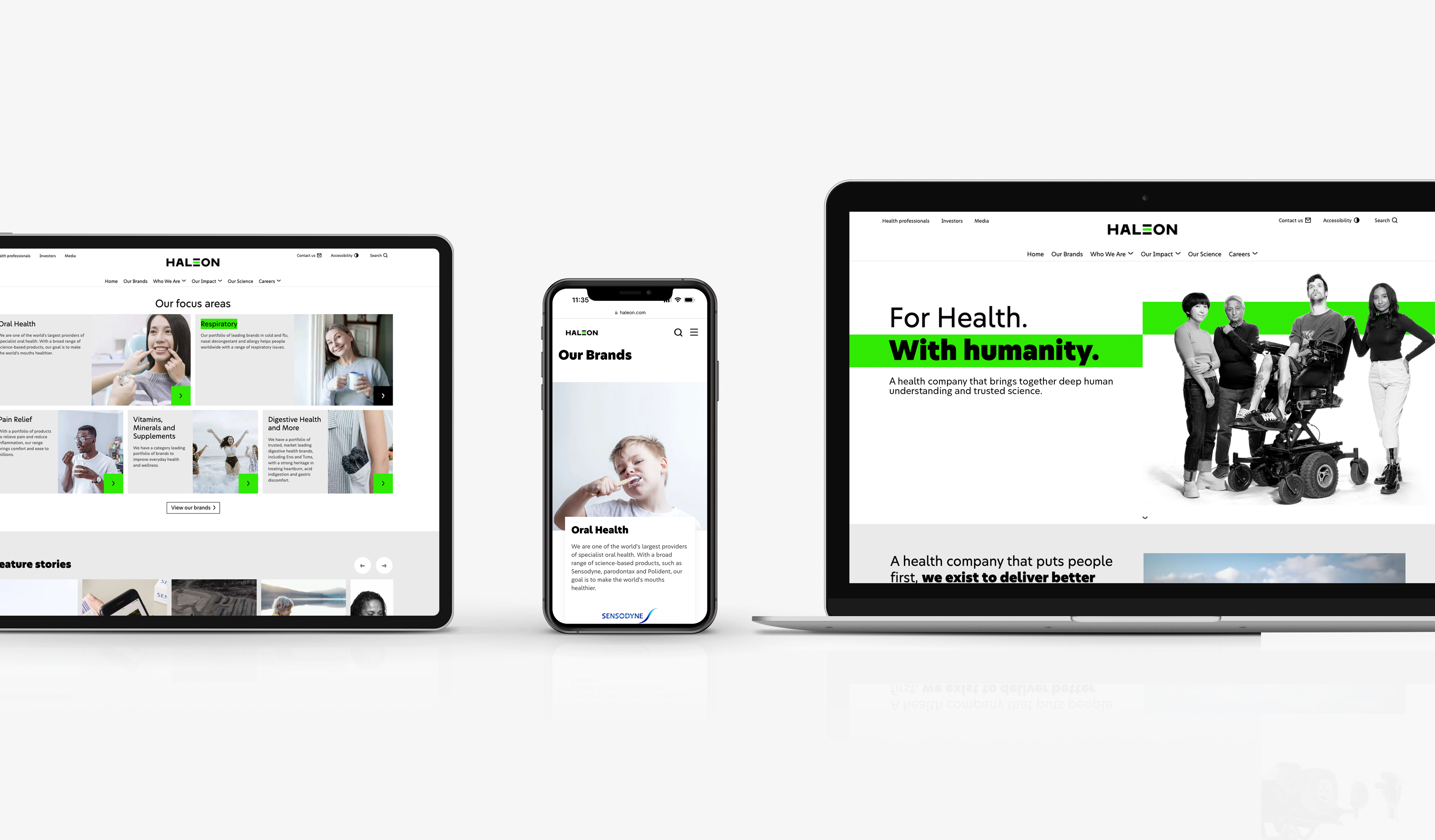
The Haleon identity puts its purpose ‘To deliver better everyday health with humanity’ at its core. Telling stories to motivate change in an inclusive, sustainable and achievable way. Setting the standard – the Baseline – for everyday health to help people to progress on their journeys. Aiming to guide and galvanise them with empathy, while respecting the reality of their worlds and challenges. Creating an everyday healthcare brand that people feel understands them.
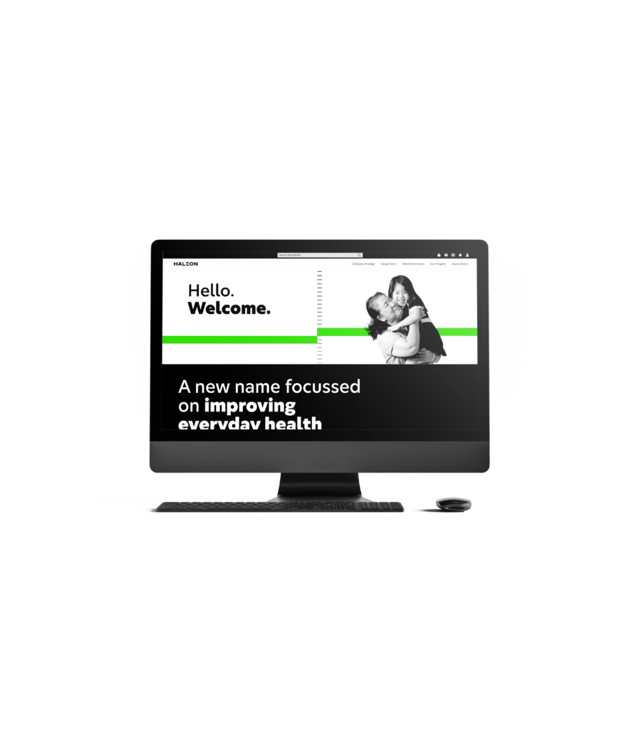
The company name had to be strong, optimistic, inspiring – and human, to connect with people around the world. ‘Haleon’ combines ‘hale’, an Old English word meaning in good health, and ‘leon’, associated with strength.
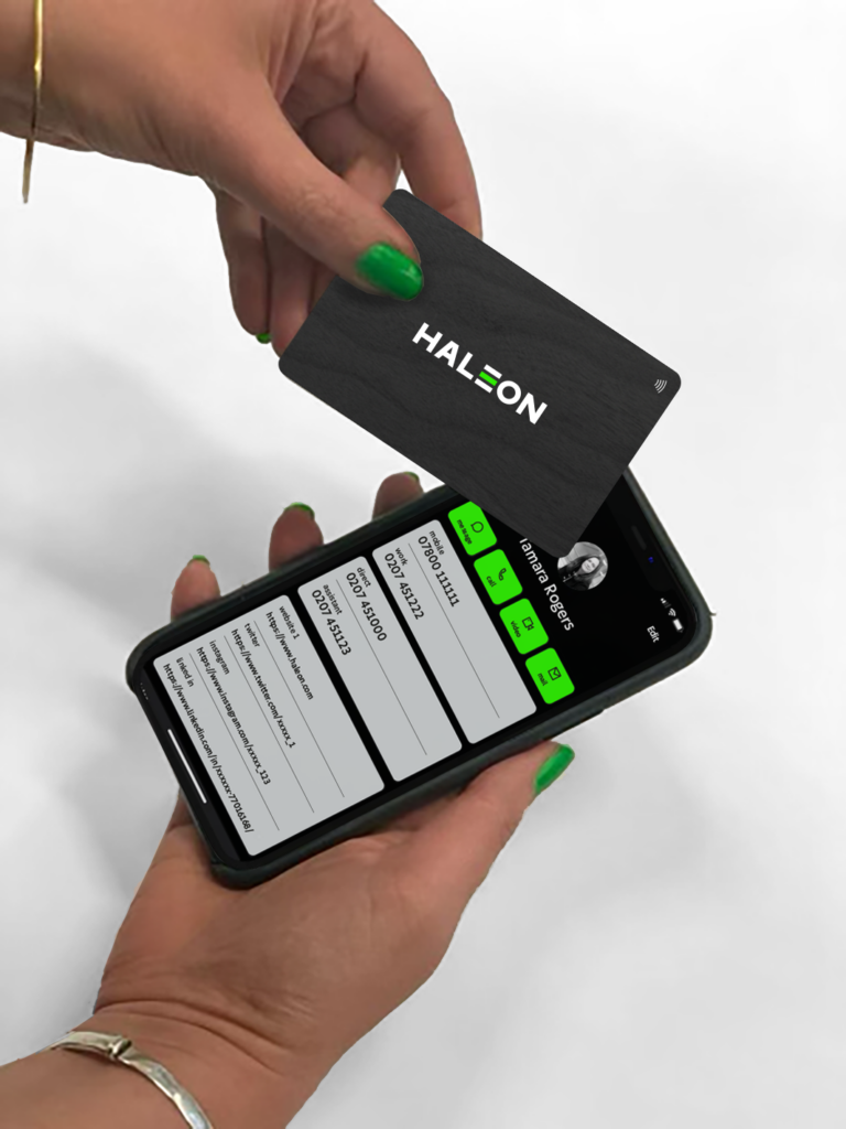
The Haleon visual identity system cuts through the healthcare-sector clutter with striking simplicity. Two key graphics – the baseline and metric – represent a visual measure of ‘better’ that unifies our communications. They highlight positive steps, performance and progress – by individuals, communities and businesses – on the journey to better everyday health. The stripped-back black-and-white colour palette is enlivened with restrained hits of punchy Haleon Green, to dial up vibrancy. And the focus is on visualising real people with real stories, always showing everyday health in an optimistic light – creating a sense of confidence that things can get better, even in the face of challenges.
Haleon became a standalone business and brand in July 2022. The demerger was the UK’s largest stock market listing in a decade.
Since launch, it has been evident through social media and personal affirmations that the new identity is highly appreciated by the employees of Haleon. From photographs next to new signage to even dyeing hair green, the team worldwide have embraced the new visual world with gusto.