From MENA to the world
Air Arabia
Office: Madrid
As a key LCC in the Middle East, Air Arabia, born out of Sharjah (UAE), was faced with a golden opportunity to leverage its position by demonstrating its leadership role in the aviation industry. By focusing on customer-centricity, placing the customer in the center of everything, and establishing strong, long-term relationships with key stakeholders, the low-fare airline has continued to build a distinctive reputation, creating value and generating growth for the company.
Middle East pioneer low-cost airline Air Arabia was at a turning point in its history, looking to become a true world-player offering real-value and greater lifestyle relevance to its key stakeholders. A friendly and familiar, Arab and youthfully-spirited airline has commenced its journey of transforming itself into an iconic brand offering memorable journeys with a rejuvenated value proposition that can connect with all audiences.
With a generous business ambition of driving significant growth in scope and reach from MENA to the world, Air Arabia connects with new customers such as families, young nomads and business travelers with a clear and credible positioning to become the most accessible and sensible choice for smart spenders everywhere.
Setting a new benchmark in operational excellence, innovation and profitability, the renewed Air Arabia brand grows from the idea “Now, more than ever” and prospers with an ambitious, customer-relevant and non-complacent personality.
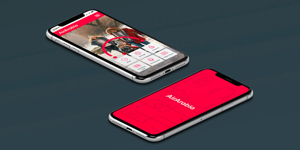
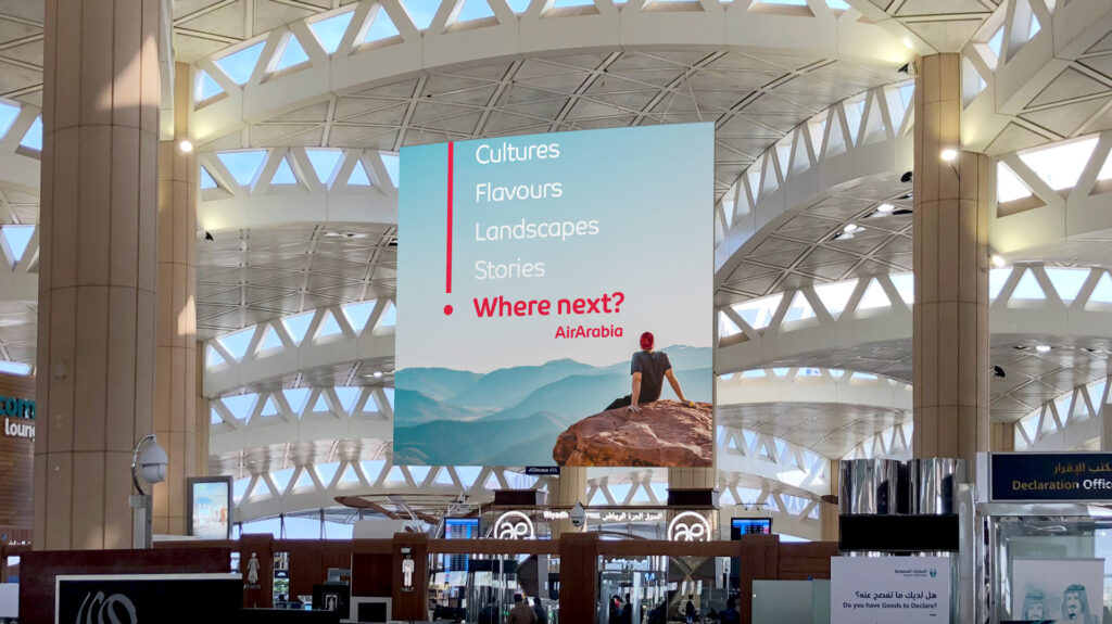
In preparation to present itself to the world and specifically to properly target its new audiences, Air Arabia created a visual universe perfectly aligned with its new brand strategy. The brand identity is based on the creative idea of “Modern Nomad” reflecting the airline’s new positioning, eager to connect with a younger, international and connected target group and communicate the value proposition of “affordable travel”.
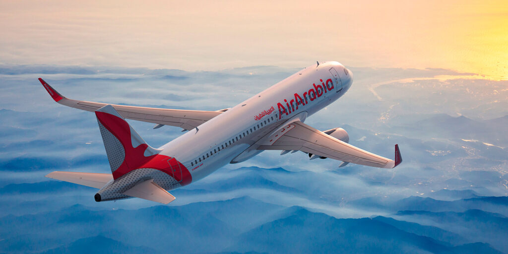
The brand identity is based on the creative idea of “Modern Nomad” reflecting the airline’s new positioning, eager to connect with a younger, international and connected target group.
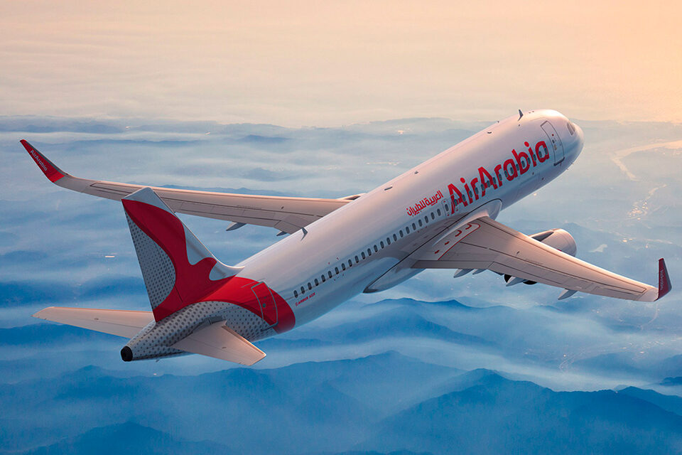
The logotype has evolved to reflect a more modern, simple, versatile, and global brand, with a morphology that provides a unique and ownable personality. The airline maintains its recognizable symbol, the seagull, but has given it a modern twist adding a fresh appeal while staying true to its original image. The new design was inspired by the angles of an airplane’s tail so that it could naturally live within that space.
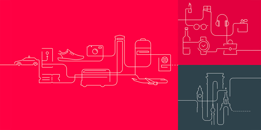
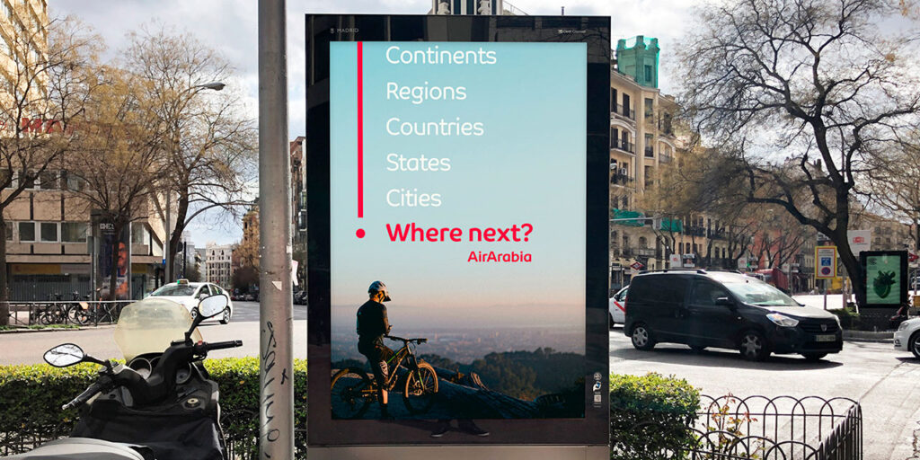
To represent the experience lived while travelling and the connections made from one destination to the next, a graphic device was created based on old cartographic systems that visually communicates Air Arabia’s new claim, “Where Next?” This resource provides a more differentiated identity for the airline across all touchpoints. A Modern Nomad is an explorer eager for new experiences – this is represented in a device of continuous dotted lines. The on-going lines represent trips already taken and experiences already lived, and the dotted lines represent everything else yet to come.
This graphic solution combined with the silhouettes of monuments and iconic destinations form the bases of the illustration style.

By focusing on customer-centricity,
the airline has continued to build a distinctive reputation, creating value
and generating growth for the company.
